Brands of the World is the largest free library of downloadable vector logos, and a logo critique community. Search and download vector logos in AI, EPS, PDF, SVG, and CDR formats. If you have a logo that is not yet present in the library, we urge you to upload it. Thank you for your participation.
Organic Critter
Gigafrost | Thu, 11/08/2012 - 19:58
Brief from client
Promote organic living for the family. Must appeal to women and children demographic primarily.
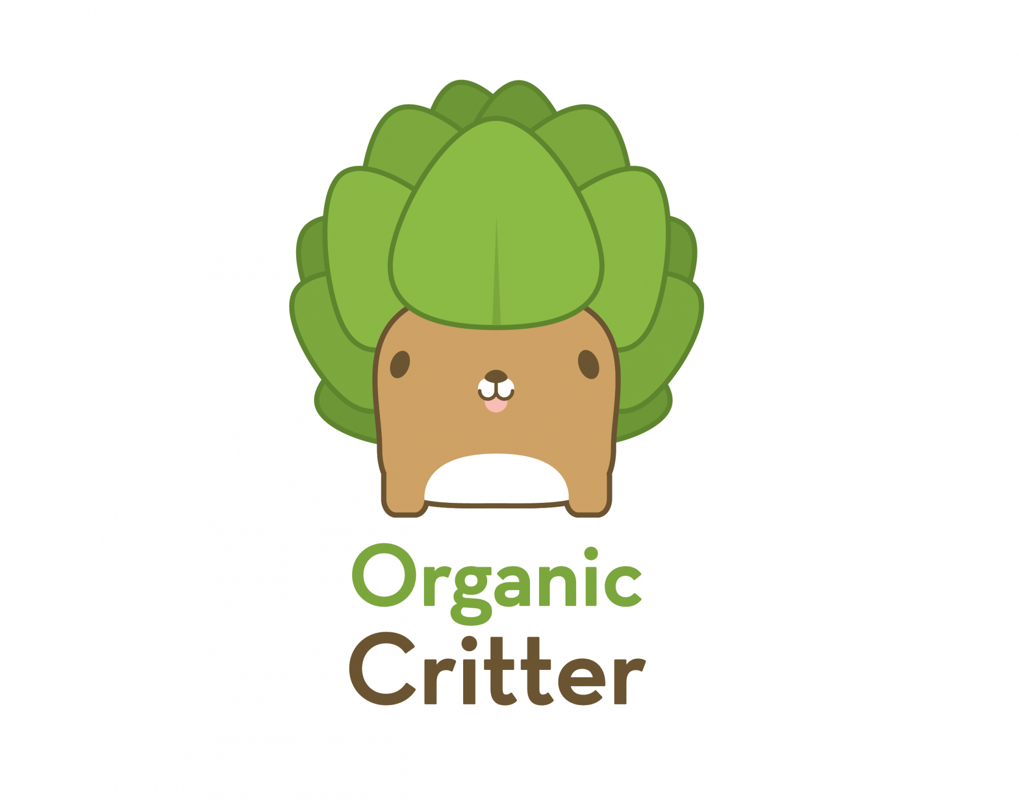
I think the white on the muzzle really brings it together. Also, I think his head looks much better now, it looks a lot more organic. I think artichoke head himself is done now, the only thing left to tinker with would be the type.
He's SO CUTE! I agree that MAYBE you could take a way a few leaves to simplify just a titch, but whatever - this (as Shawali stated perfectly) is Cute. As. Hell.
That is pretty sweet! Nice artwork, font colour and choice goes really nicely with the "creature" :)! All round not much one could criticize about it...
I'd like to see how it incorporates into a site or a design, but as a logo - really nice :)!
It would be nice to see a few different iterations when scaling to a smaller size for hang tags, plush tags, logos, business cards. I like it.
Personally, I think that you should keep "Organic" and "Critter" the same type size. Its odd that the "C" and the "O" are different sizes. The kerning in "Organic" is different than "Critter" and that also has an unfinished look to it.
The leaves alternating colors is very nice. Do you plan on having multiple version of "critters" with different leaves?
8 Comments
I like it. However, if you want to simplify you might not need as many leaves to convey the same thought.
I think the white on the muzzle really brings it together. Also, I think his head looks much better now, it looks a lot more organic. I think artichoke head himself is done now, the only thing left to tinker with would be the type.
This is cute as hell.
You nailed it. Congrats.
PS : it still looks like a Pokemon but it's ok =)
Awesome!
Eeeeeeeeehehehe!
He's SO CUTE! I agree that MAYBE you could take a way a few leaves to simplify just a titch, but whatever - this (as Shawali stated perfectly) is Cute. As. Hell.
Good job!
Very good art, but deep down like a pokemon, you agree?
That is pretty sweet! Nice artwork, font colour and choice goes really nicely with the "creature" :)! All round not much one could criticize about it...
I'd like to see how it incorporates into a site or a design, but as a logo - really nice :)!
It would be nice to see a few different iterations when scaling to a smaller size for hang tags, plush tags, logos, business cards. I like it.
Personally, I think that you should keep "Organic" and "Critter" the same type size. Its odd that the "C" and the "O" are different sizes. The kerning in "Organic" is different than "Critter" and that also has an unfinished look to it.
The leaves alternating colors is very nice. Do you plan on having multiple version of "critters" with different leaves?