Osaka Japanese Cusine
sgunther17 | Wed, 11/28/2012 - 20:44
Brief from client
Wanted a new logo for their website, specialize in sushi and would like to emphasize on that, also can separate them if needed.
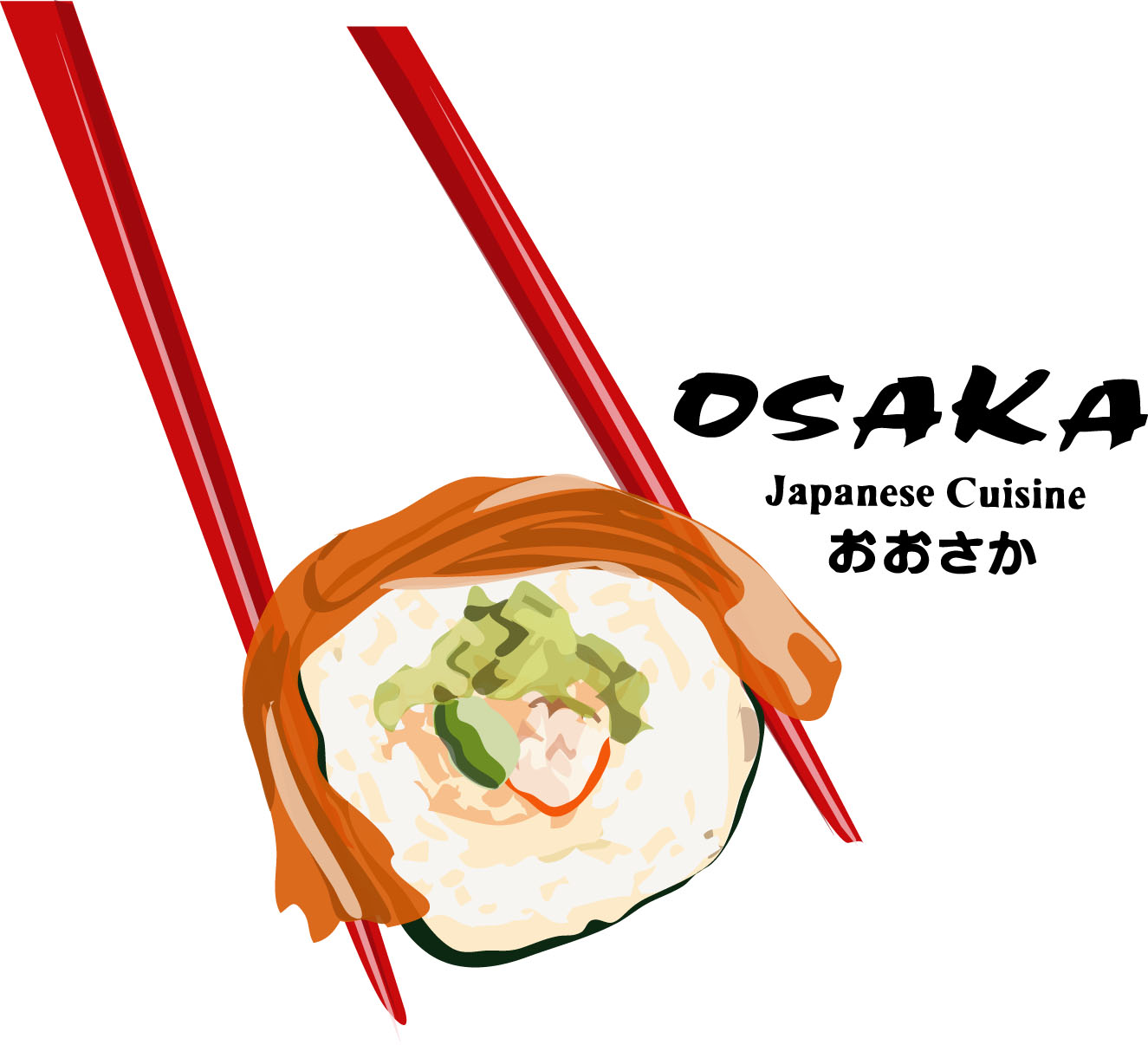
I drew the Sushi in Illustrator with tablet and had a lot of fun with this one, though probably not practical for something super small.
8 Comments
The symbol is too big! Make it smaller and with less details, maybe without the chopsticks. If you manage to put the type and this symbol toghether you will be good. Also, maybe a different type and color on the Japanese Cuisine slogan?
This is not a logo, it's a banner.
You need to simplify it tremendously. And find a more creative idea.
I see sushi joint with the exact same font every day.
Sadly, that's the font of their restaurant had already they did not want to change it.
Then I'm afraid that they will have to stick with a bad logo design and are willing to lose customers because of it!
Ignorance of some companies make me sick :/
I don't know if they will loose customers because of that. At least, it does the job, it clearly says "sushi".
I personally never dismiss a restaurant because it has a shitty logo =)
Oo I misread the comment, I thought they didn't want to change the logo itself, not the font. I was going to rage out with a "why are you here then!?" speech ;3
Done and redone. Nothing inovative. I just hope they won't loose clients. /kiss Gigafrost. : )
buenisimo