Brands of the World is the largest free library of downloadable vector logos, and a logo critique community. Search and download vector logos in AI, EPS, PDF, SVG, and CDR formats. If you have a logo that is not yet present in the library, we urge you to upload it. Thank you for your participation.


7 Comments
Love it.
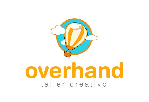
I kinda like the symbol but these strokes bum me (as strokes generally do with me).
I can't help but feel that there's no clear connection between the symbol and the word mark.
I'm not a fan on the type and the colors. They make the whole thing feel a bit kid-ish.
Yeaa! You cleaned up your first version nicely. Good job!
I like the kind of childish and cartoonish style of the symbol in combination with the bright colours, only thing I would maybe do is make the text the same colour as the symbol as now they look like 2 seperate things
I also doubting the stroke. love to see a version without the stroke.
but the symbol is not real problem. I have more worries about the typo, it seems to big and to bold and the subtitel is to small in combination with the headline and the symbol.
Your almost there!
cool post brother <a href="http://www.thanksgivingdayy.org/">thanksgiving day<a/>
good post!
http://www.christmasnewyear.org/