Brands of the World is the largest free library of downloadable vector logos, and a logo critique community. Search and download vector logos in AI, EPS, PDF, SVG, and CDR formats. If you have a logo that is not yet present in the library, we urge you to upload it. Thank you for your participation.
Know that you can have several iterations of your logo, with different compositions for example. That way, you'll have more flexibility depending on the environment your logo will show up, may it be a webpage, business card, etc...
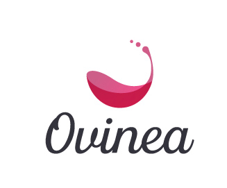
I much prefer the stacked logo to the horizontal logo, but this is simple and wonderful. I do get more of a wine store read than a wine bottle store read, though.
I like the logo, but I think the font should be made easier to read. If you were to lighten the opacity and change the size it wouldn't be so hard on the eyes. besides that i really like this logo.
11 Comments
Btw, i think im going to visually align the horizontal version as it looks a bit out of place.
Dead on!
You just got yourself a really cool logo!
Know that you can have several iterations of your logo, with different compositions for example. That way, you'll have more flexibility depending on the environment your logo will show up, may it be a webpage, business card, etc...
Great job, please some back with more logos =)
Looks great! The wine symbol looks low-res for some reason though, but the logo looks really nice.
THank you, please define "low-res"
Low resolution. It's not terrible, and it's not a problem here, so don't worry about it. I'm just used to critiquing larger logos :)
OOHH! small!
Ok, no worries :D
I much prefer the stacked logo to the horizontal logo, but this is simple and wonderful. I do get more of a wine store read than a wine bottle store read, though.
I do prefer the stacked version, the horizontal one is only for the web, to keep it as low as possible and not lose content to display.
Thank you for your thoughts.
Client today said they like this version but with a diferrent font...
Hold your chakras and see what it turns out :S
Ha that's too bad, the font and the symbol nicely match each other.
I like the logo, but I think the font should be made easier to read. If you were to lighten the opacity and change the size it wouldn't be so hard on the eyes. besides that i really like this logo.