Brands of the World is the largest free library of downloadable vector logos, and a logo critique community. Search and download vector logos in AI, EPS, PDF, SVG, and CDR formats. If you have a logo that is not yet present in the library, we urge you to upload it. Thank you for your participation.
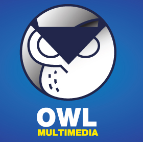
the idea is ok but it took me few seconds to understand the symbol. You should remove the upper part of the circle (above ears) and make the ears less "solid colors". Try to make the owl look like an owl, without too much elements, but expressive and personal. The yellow in multimedia should go out...
I like the idea, but the owl symbol is a little complicated. I also would like to see pupils in the eyes over any other detail or is the owl supposed to be asleep? The crescent shape line that crosses behind the owls' left eye looks a little sloppy. You might try removing it and make the beak and ears more fluid to compliment the other lines of the symbol. Also loose all the gradient shading it is a distraction during the design stage.
The owl is too complicated and don't get it with the thing on it's head. Also the strokes - on the owl's chest for example, they look terrible, and clearly done badly in illustrator. I'd either make them all the same length and/or, makes the caps have rounded ends.
Typography is bad - words at least need alignment and I'd change the font completely too. It's all very basic and unimaginative.
Address the above and maybe the colors won't look so bad, but i'd change them too as they're like two colors chosen randomly from a primary color chart.
Im sorry its hard for me to see the owl, make it more visible, sleek.
after 1 or 2 sec looking at it i didnt like it.
Needs to catch my attention faster.
6 Comments
the idea is ok but it took me few seconds to understand the symbol. You should remove the upper part of the circle (above ears) and make the ears less "solid colors". Try to make the owl look like an owl, without too much elements, but expressive and personal. The yellow in multimedia should go out...
Thanks for your feedback i'll give it a try
I agree with hueroth. And try to avoid degrades.
I like the idea, but the owl symbol is a little complicated. I also would like to see pupils in the eyes over any other detail or is the owl supposed to be asleep? The crescent shape line that crosses behind the owls' left eye looks a little sloppy. You might try removing it and make the beak and ears more fluid to compliment the other lines of the symbol. Also loose all the gradient shading it is a distraction during the design stage.
The owl is too complicated and don't get it with the thing on it's head. Also the strokes - on the owl's chest for example, they look terrible, and clearly done badly in illustrator. I'd either make them all the same length and/or, makes the caps have rounded ends.
Typography is bad - words at least need alignment and I'd change the font completely too. It's all very basic and unimaginative.
Address the above and maybe the colors won't look so bad, but i'd change them too as they're like two colors chosen randomly from a primary color chart.
Im sorry its hard for me to see the owl, make it more visible, sleek.
after 1 or 2 sec looking at it i didnt like it.
Needs to catch my attention faster.