Padres de Hoy
ManyaPeru | Fri, 07/19/2013 - 22:46
Brief from client
Padres de Hoy is a portal that provides information to parents about the nutritional care and education of babies and children, among other topics.
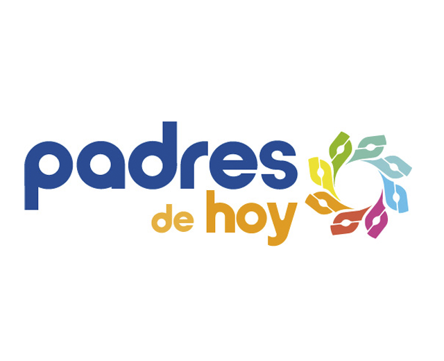
Manya.pe team created the isotype of the company, that focusing on the union of three concepts: attachment, caring and community. These three concepts make a circular figure of a sun or a flower. In addition, each element in that circle represents a shaking hands, transmits the mutual support among parents.
The fonts of the logo has circular shapes that attracts and facilitates visual reading.
1 Comments
Hey guys!, i got to say the idea its good, but you have to make some improvements about the font, look a bit messy to me, despite the curves
and stuff seems to be design from scratch, i recommend use a regular font with those features (rounds and curves) and use a uniform font color, these because you have placed "de hoy" just right side the symbol, and the colors of that symbol have a heavy impact of color perception resulting on a lowest readability. You could fix this using different font height style for example "padres" at bold and "de hoy" on light or regular. This change on the font style benefit the value of the symbol and make the font more readable.