Paquette Property Management
MB Design | Tue, 04/10/2018 - 17:27
Brief from client
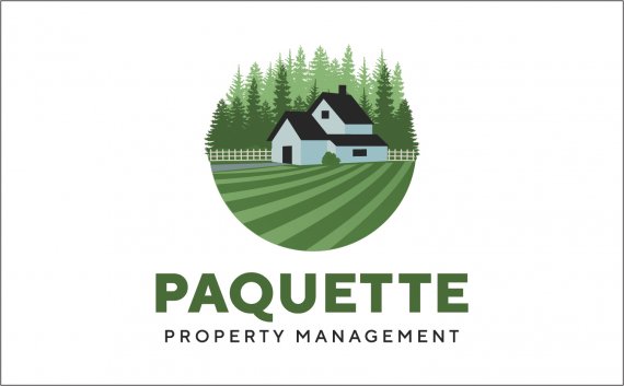
The client does mostly yard work but also works on houses when asked. He wanted me to make the focal point a yard but wanted it to have a clean residential feel

I went through some logos with the client and he kept pointing out logos with a lockup like a circle or square so I went in that direction. I got feedback that he didn't like the house and wants to scrap the whole logo so any feedback would be very helpful since I like this logo and don't want to give up on it.
Thanks in advance!


6 Comments
So,
As pretty of an "illustration" as this is, it can't constitute as a logo. It is way too complicated, there is absolutely no way this could be turned into black and white for certain occasions, etc.
This is what you need to do:
1: get this down to 2 colors. 1 would even be preferable, but since you have layered trees, 2 is fine.
2: simplify. Break this shapes down until you can make this logo black and white, and it still makes sense. Also kill small details that won't be necessary once the logo is shrunk down
3: Brighten your colors a bit. This is supposed to be a beautiful serene home, it looks like fog has descended on the land here.
I 100% Agree with everything you have to say. Thanks! I will make those edits, but will wait to see if there is any further feedback. As for the colors, the upload lost a lot of vibrancy.
I do have another option that may help with the simplification:
I say it needs to be simplified even further than this. I know that sounds daunting, but if the client doesn't even like the house, it is probably going to be your best bet.
I agree it still needs to be simplified more but do you think playing with negative space like this may help to do that? I have been staring at this for too long to have a decent perspective.
Yes, I do think pushing forward with negative space like that will help this out a lot.
Agree with Ernis, I think you need to simplify it. A good start though