Personal Brand
BmBeards | Sat, 07/13/2013 - 02:45
Brief from client
Personal Re-Branding

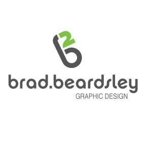
This logo is still in its first stages as I find it very difficult to re-brand ones self. Not even the colors are chosen as of yet (so the grey/green combo is not set in stone). I would love some initial feedback! The concept obviously being that my initials are BB, I wanted to focus on a "b squared" concept.


5 Comments
Nice but what the heck is the "2" for? Obviously for "b squared" but that's not your name, so don't use it. Or use it and loose the name and focus on the logo. Why is there a period between you name?
Thanks for the insight! I would have always thought to typeset my name alongside the logo. I also see your point with the period. No use for it, consider it dropped :)
Try, B's or b's.
I'd have the symbol straight up. The leaning is very uncomfortable and unbalanced.
I don't mind the b² thing.
I'm not a fan of the font for the subtext. It's not really gelling with the main one.
Good luck!
Noted, and I have attached a strait up version with no text. Any crits on if this is a well enough executed logo to stand alone (say on a letterhead, website etc..)? The thought of distressing it a bit crossed my mind as well, any thoughts on that?
Thanks again everybody!! Much Appreciated