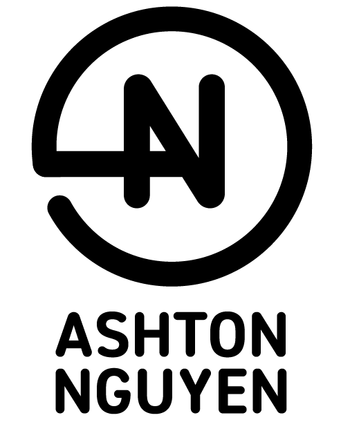
Personal Brand Logo
Van Buren | Mon, 05/21/2018 - 04:23
Brief from client
This was a recent re-vamp of my first logo I did years ago.

I've gone through many different iterations for my personal logo, ranging across many different styles, but I've finally landed on this idea. Even with this one I've gone through multiple different tweaked versions, but thought this had the most going for it.
I wanted to go for a very simple mark. Although perhaps it's a bit too simple. But I've been staring at this for too long now so I'm looking for some good old critique. Have at it, and thank you for the feedback.


2 Comments
The bubble font feels dated. Does the circle cut in to attempt to form an "A"? In my opinion, you have a very interesting name. Would be cool to see a version that has a mark instead of a monogram to compliment your name!
The idea behind this is ok, although I tend to think that this kind of visual trick are bit too easy/dated.
But in my opinion, this is far from being done. Keep working on it to make it more subtle and give it a more organic aspect.
Keep it up!