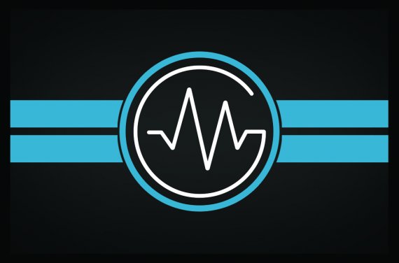
Personal Businesscard for dj MasterGroove
Mastergroove | Mon, 04/25/2016 - 22:13
Brief from client
Made this for myself, business card for an upcoming dj.
I incorporated the M and the G from MasterGroove.
Tried to keep it young and clean.

Made this for myself, front side of business card for a upcoming dj.
I incorporated the M and the G from MasterGroove.
Tried to keep it young and clean.
I usually try to avoid gradients and mostly make logo's that are possible to print in 1 color.
But this was a design for a business card , so I made sure it would all fit and look (somewhat) good.
Please don't hold back on your thoughts!
I'm not a professional designer but i'd like to get experience and get better.


2 Comments
I like the idea and the colors you have going on - I think they work well for the audience you'd be marketing to. I think it would look even better without the two blue bars behind the circle - just the circle itself would be striking.
Also, it looks like the white part of the symbol is getting a bit lost with all that blue and black. It might help if you made it a tad thicker, so the thickness matched the thickness of the blue circle and the black space between the blue and white.
I like the general idea but it needs to be drastically simplified. Get rid of the blue stripes and circle.
The M isn't obvious enough with this sinusoidal. You might want to fix that.
Other than that, this logo has potential.
Keep it up !