Personal Health Program.
calebbruner | Mon, 11/05/2012 - 22:31
Brief from client
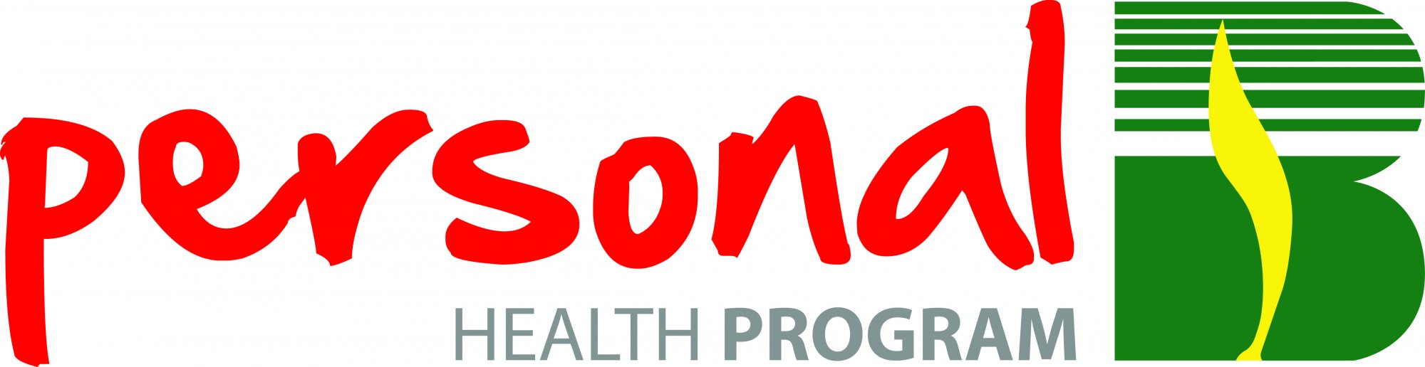
In this, i am stuck with that 'B' and the colors as they are the company standards.
Ive change my layout a little since the previous version.
In this, i am stuck with that 'B' and the colors as they are the company standards.
Ive change my layout a little since the previous version.
3 Comments
Seems like a Gas company
I think the symbol works better on the right. I still don't like the red type.
I'm really sorry, but other than the symbol being on the other side- how is this much different than the other one!?!?
I saw that you said you're stuck with that symbol- and with the colors (which is so unfortunate!) but can you pick a different font for "personal" and "health program". I'm really sorry that you're stuck with all of this stuff- because it really doesn't work well together. But I don't think you're helping yourself out by using that same font for personal again. I think I recall you saying something about wanting it to look handwritten, ie- 'personal'- but I don't think you need to keep using this font.
Change it up BIG time this time- as much as you can while still keeping what the company requires. (Essentially, play around with the placement of stuff and the fonts!)