Personal Logo 10
TheDesigner33 | Sat, 08/15/2015 - 23:46
Brief from client
Personal logo for myself

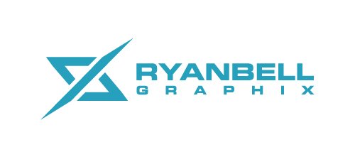
This is another attempt at a personal logo. Its supposed to be my initials RB with an "X" effect for graphic design or "graphics". Im trying to create an RB logo i have never seen before and RB doesn't have many option for combining them and looking unique and different than other logos i have seen. I still feel this may need some tweaking and looking for some feedback on what i can do to improve the the logo itself? and if there are any typeface suggestions it would be much appreciated


11 Comments
how the letters are combined together
different color variations
black on white
white on black
A bit too corporate for a graphic designer as it lacks some kind of human touch.
But it works. You need to fix the kerning though.
An interesting symbol, but even with you breaking it apart to show the letters, I see neither letter in the logo.
Unless, are they lowercase? Okay, I guess it works a bit. I still have a hard time making them out, sorry.
I'm not a fan of this on a number of levels. I love the font Eurostyle, but it is so tied with the last decade that I think it is a poor choice, unless you handle it in a new way. As a designer kerning needs be second nature, something as important as your mark should have never left your desk with the Y and A spaced like that. I'm sorry I don't get the symbol either, the R is not apparent to me at all.
And on a last note the misspelling of GRAPHIX is a big no in my book, as I told another designer this gimmick would send it straight to the NO pile during a portfolio review. Sadly the bottom line is there are a lot of really good designers all competing for the same work, when I look for a freelancer I get 100s of submissions and have to weed many out without even looking at their work. Your personal brand seems like just a fun exercise at times, but the reality is that it's very important to get the attention you need. I know I sound like a total a-hole, but my goal is to help you put your best first impression out there.
Im not going with this design, it was a work in progress anyway, and i spelled graphics like that on purpose
and I'm not starting out and I'm not a beginning designer
My apologies, no offence was intended. As an experienced designer then you should have seen the awkward kerning, your clients may miss it but an AD never would. And as for the spelling of graphix, I've had this discussion with more than a few other senior level ADs and designers and it is something that would send your portfolio to the bottom of the stack. I know it is intentional,but it comes across as tacky, like a bad dj name. I reveiw and hire from portfolios several times a year, take from it what you will. I wish you nothing but the best of luck.
i said it was a work in progress