Personal Logo
Virgilio Gomes A. | Tue, 10/30/2012 - 00:36
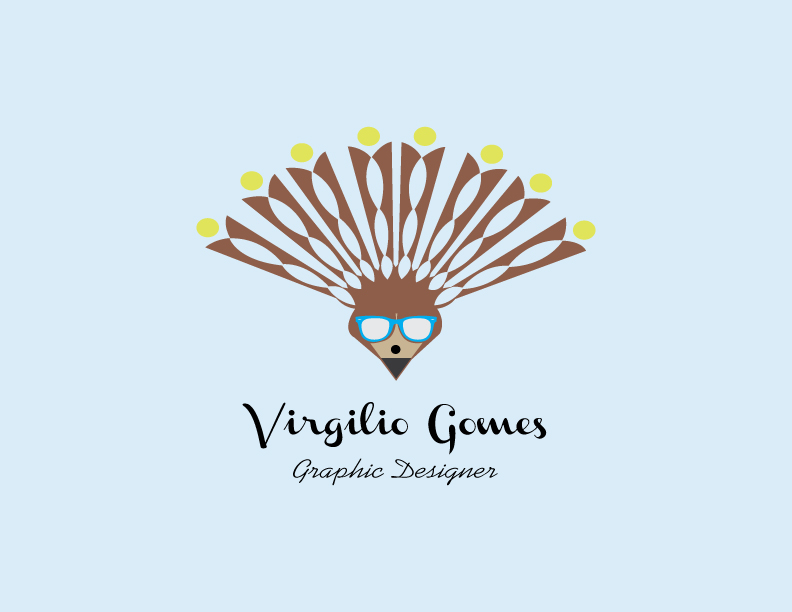
Brief from client
Well, i want to make a rare logo that express what i really do, I made a face with a rayban glasses, because, I always have one, also a pencil in the face to show what i do and a relation with design, but, i don't know if it's working, please help me.
9 Comments
Really rare logo. Complex too. Colors? Just choose two or three. Typo, ok, but it could be better, with a little bit of punch.
It is really important that your clients notice that you uses that old fashioned ultra exploited Ray classical & boring Ban's?
¿Pencil? Dude, people like to use them iPads and other tablets. They think that pencils doesn't exist anymore and if they do, is just about they could be used to decorate a boring desktop.
To buy a computer, would you like to know that the vendor gets bed with a semiconductor?
To buy a drug at the drugstore, would you like to know that the front man likes to pinch his arm?
It is not necessary to know what about "you". Everybody will love to know that, even naked, you can achieve their dreams.
Cheers
Sorry about my english, it is because this really annoyed me.
I think a Pencil is truely the right decision.... Graphik designers use them 2 scribble ore layout. in my opinion the only problem is that their are 2 many elements inside of the logo....
If u look at the big brands, all prosperous brands got really simple logos ( LV, YVS,Hugo Boss...)
Sorry but this is not working on so many different levels. The symbol is an explosion of ideas, but none of them cohesive. I would normally try and isolate one part that could work as a concept, but I don't see it. The type doesn't work. You have two conflicting handwritten styles. The color scheme is odd and not very attractive. I would suggest you start over and try and come up with a "simple" concept to symbolize you as a designer.
Looks like a peacock to me... Try to convey one message in a split second, not the whole menu...
I don't hate the font, but I always like to see a sans serif (or at least a non-script font) being used as subtext when the main text is so scripty.
As for the symbol you've got going, I dunno... It's really complicated, and it doesn't make sense to me. It looks like a paper cut-out peacock or something. I don't think adding the Ray Bans does anything productive here. If you want a logo with ray bans incorporated, that could probably be made to work- but I don't think it's working here- there are too many elements. Maybe take a step back and see how you could incorporate the glasses (if you really MUST have the glasses as a part of your logo, that is) into a cohesive logo that makes sense.
Main thing: You want your logo to represent just how great of a graphic designer you are- it's the first thing some people will see of your work, so it's gotta be great. If I saw this logo and was contemplating hiring you, I'm sorry to say - I wouldn't. Start fresh with a new idea!
you could maybe just use the raybans and the pencil head and get rid of the rest. I like the font but i agree that the subtext should be a sans font. You also need to think about colours, at the moment there are way to many colours of which arnt very nice, try your logo in just black and white first to see if that works then try adding colour once you've found something simple and effective
Though almost everybody have good and fair point, especially Sara, I see a lot of potential in your logo.
Keep the pencil and the sun glasses, find a sans serif font for the sub text that nicely complement the main font (which is really cool)
Without, you'll have a simple and nice logo.
Thanks you all, I will work in something new, I think that it isn't at all what I want to express, now I'm working in a new simple concept. your critiques really liked me :D Now I have a new vision from a personal logo, thanks you a lot.
I'm sorry for my bad english
Well... sorry peaople, but I really like it!!!! But at the end you must feel it like it was you.
Gostei, ao contrário de todo mundo. Acho que está uma boa ideia. Mas vc tem que sentir se o logo te representa bem ou não. Eu gostei.