Brands of the World is the largest free library of downloadable vector logos, and a logo critique community. Search and download vector logos in AI, EPS, PDF, SVG, and CDR formats. If you have a logo that is not yet present in the library, we urge you to upload it. Thank you for your participation.
Version history
Version 1

- I
- S
- T
- C


8 Comments
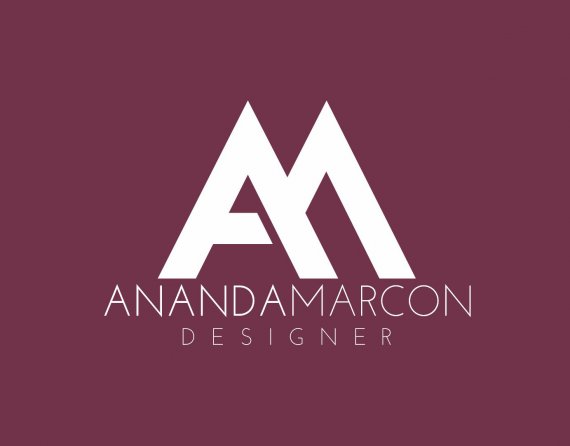
I think it could have a space between the Ananda and Marcon, in order to have contrast and value the symbol.
i really like it! however i agree with cristiano, there should be a space between ananda and marcon. The other thing is, I have recognized the A from your symbol but not the other letter.
Nice work though
Agree with the above. Other than that, very strong logo.
This is very simple and classy. I do think you might try the name in Futura...that would give you the angles on the M. I don't mind not having the space between the name, you might consider altering the weights a bit more to make the distinction between first and last name. Nice logo!
Nice one indeed. Just loosen up the elements to let the composition breath.
Very nice, and that symbol is very effective. To be honest, I normally dislike when designers use two letters together to make a symbol(sometimes it feels a bit overdone), but it works really well with this font and formatting.
Overall, this is a great, sleek logo that would work great for any type of printing or web use cases(I can even think of some neat animations that would work well with this). Great job.
I like the logo, i attached my only possible critique at the moment :)
Like it.