Brands of the World is the largest free library of downloadable vector logos, and a logo critique community. Search and download vector logos in AI, EPS, PDF, SVG, and CDR formats. If you have a logo that is not yet present in the library, we urge you to upload it. Thank you for your participation.


13 Comments
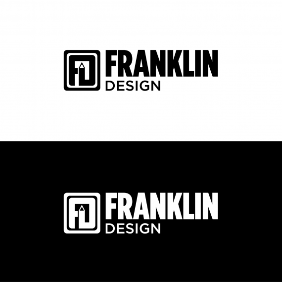
I'd get rid of the subtext. The symbol ad the whole in and out of itself is self-explanatory.
I read FJ
Edited it, looks more like a D now?
Now - it does, good recovery!
Looks good to me, and now that Shawali mentioned it, I agree with what he said about the subtext
Looks fine. Symbol on its own can work, too. One of my idea here.
https://www.behance.net/gallery/27655509/Franklin-Design-Brand-Guide
Done a quick guide based on the finished logo
Splendid job! Nice presentation and love that GasMonkey logo.
Excellent presentation, very nice.
Good job.
CAMOBAP, I had the gasmonkey logo critique on this site a while back
http://www.brandsoftheworld.com/critique/gas-monkey-0
Glad you like it ;)
Well done. Works on all levels for me.
Looks great, my only suggestions are to expand the points on the top of the "A" so it is square and fits in with the other letters in "Franklin" a bit better and also to put design next to franklin bigger instead of underneath it. Make "Franklin" bold and "Design" a smaller weight. The way the three elements interact is a bit off and I think that would fix it. Otherwise, good job!
simple but nice one!