Brands of the World is the largest free library of downloadable vector logos, and a logo critique community. Search and download vector logos in AI, EPS, PDF, SVG, and CDR formats. If you have a logo that is not yet present in the library, we urge you to upload it. Thank you for your participation.
Version history
Version 1

- I
- S
- T
- C


10 Comments
I usually advise designers to not use their initials in their logo, but monograms are actually the one way to do it =)
I think this works pretty well. Though I don't really see the Asian influence.
I would keep working it, trying to bring some slight cosmetic arrangement, such a bit of distressing, rounded angles, etc...
Pro tip: when you upload your logo, make sure you a good amount of white space around it, so it's as much "in your face" that it is now =)
Good job!
Thanks!
And noted, I considered distressing it, wasnt sure how it would be recieved. And I appreciate the pro tip. I kinda just put a white background behind it and threw it up lol.
Initials... done right!
Please take notes everyone.
This is a great start.
I understand the Asian influence here, but it would be great if you pushed it more. I think all you have left is refining!
Thank you!
In what ways do you think that I should push it? Distressing like my friend up top suggested or something else?
Round the corners perhaps. Maybe add some various weights to the letters. Tweak things until you like them. Until it feels right.
Personalize it a bit more. Sorry, I can't provide more specific advise.
Between this and that Traek guy, I'm seeing some GOOD monograms here. Agreed with above, this is very well done.
I agree with all above and definitely agree with rounding of the sharp edges
clean.I like it!
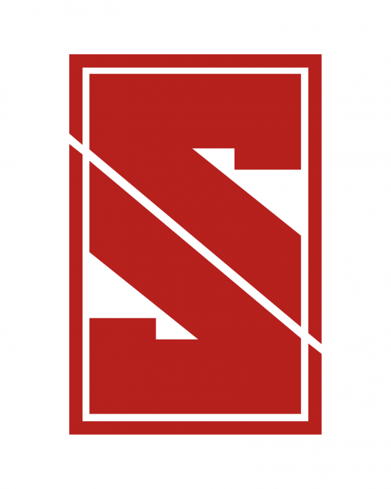
I do not see " J " here. To me it looks just a stylish " S " with a diagonal slush. If you flip this symbol horizontally either way - it is " VA ". I think there is a way to establish " J " more clearly. Good luck.
I actually thought this could be a new logo for Stanford because of the color and the collegiate stroked blockiness and to me it also looks like an "S". Maybe explore an ink feel as well as try giving it some three dimensionality while retaining that superb shape balance.