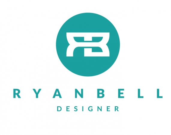
Personal Logo 8
TheDesigner33 | Wed, 09/24/2014 - 04:45
Brief from client
my own personal logo, still not quite sure what i want

This is another logo i came up with really needing some positive feedback about this one. i have couple variations. It has my initials RB linked in the middle. One variation the connection goes all the way through from R to B, the other it is attached on the bottom. Also would like to know if the circle is okay. Thanks!


9 Comments
Secondary of first logo
Logo with link connection on bottom
Secondary of Second Logo
I like it! I'd go for the 3rd design. Also your logo reminded me of the Bugatti logo for some reason. Also maybe lower the spacing a bit on the upper text? It's just a little thing but i get the feeling its too far apart. Keep at it!
I have actually never seen the Bugatti logo but thank you for the feedback, i agree with you my name is a little to spaced out, i will tweak that for sure
I think this is my favorite so far. It's kind of cool that you get a second R in the first version but you get a little depth with your version 2.
Thanks for the feedback, so do you think i should go for the version with the center band of the letters going all the way through giving it a 3D look, or the other version where it is attached at the bottom?
I think I'm leaning towards the first one.
Alright thanks, appreciate it