Personal Logo that I would love for you to destroy and tear it apart
feedback_pls | Fri, 01/11/2019 - 07:07
Brief from client
I am the client
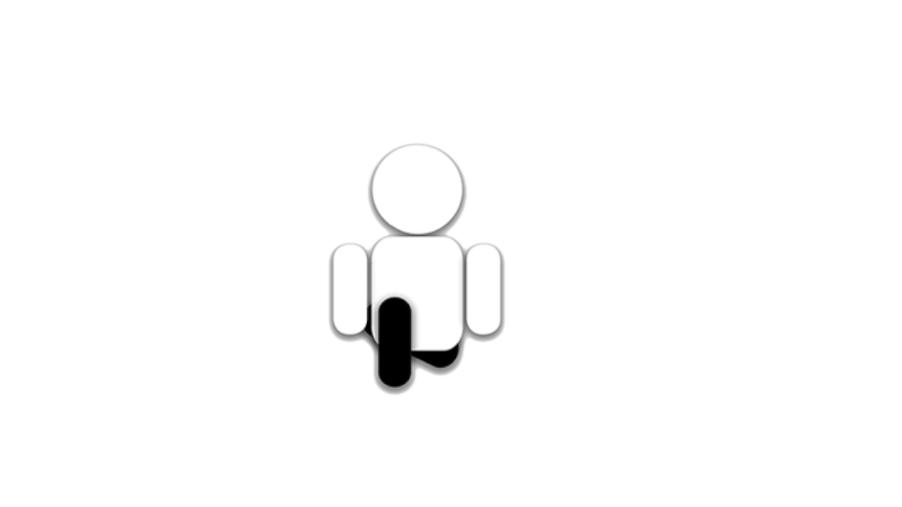
My name is Neel and this logo is supposed to be a play on words and make it so it looks like the guy is "kneeling" IDK if it makes sense and if it is even a good logo. So, tear it apart and help me stitch it together. Thanks
4 Comments
So is the name of your company Neel?
I mean, I got that the guy itself was kneeling. But I don't understand why, or how it relates to you or your company, other than your name being Neel.
On top of this, I'm going to be harsh, your little guy with the drop shadow behind him looks like clip art. Its a bit dated.
It would really help if we had a brief about who you are, what you or your company does, and how this little guy relates to it.
First off, I love your screen name.
Second, I find the idea behind this logo pretty clever. The pun is strong in this one.
Third, from a design point of view, it is way too simplistic and roughly made. I'd leave off the computer and spend time (a lot of it) sketching out ideas on paper.
First off, I love your screen name.
Second, I find the idea behind this logo pretty clever. The pun is strong in this one.
Third, from a design point of view, it is way too simplistic and roughly made. I'd leave off the computer and spend time (a lot of it) sketching out ideas on paper.
First off, I love your screen name.
Second, I find the idea behind this logo pretty clever. The pun is strong in this one.
Third, from a design point of view, it is way too simplistic and roughly made. I'd leave off the computer and spend time (a lot of it) sketching out ideas on paper.