Brands of the World is the largest free library of downloadable vector logos, and a logo critique community. Search and download vector logos in AI, EPS, PDF, SVG, and CDR formats. If you have a logo that is not yet present in the library, we urge you to upload it. Thank you for your participation.
Phonix
waldo León | Sat, 10/20/2012 - 05:37
Brief from client
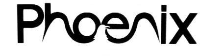
Something modern, simple, and unique. Rising like a Phoenix.
I love the general idea and the symbol! But it will do you justice if you go with a thicker font. You can tell that your font is too thin because of your "H" getting rather deformed by your birds wing, and the "N" stretching out. Now for me I could just be nit picking.
A thicker and more crisper font would be best, without the rounded corners of course. Also try making it orange!
5 Comments
yes, modern and simple, good
The idea is great and can work really well. But right now, it doesn't. The curbs of the H and N needs some serious tweaking.
The font you used is weird, especially the capital P and the I, which looks thinner than the other characters.
I agree!
I love the general idea and the symbol! But it will do you justice if you go with a thicker font. You can tell that your font is too thin because of your "H" getting rather deformed by your birds wing, and the "N" stretching out. Now for me I could just be nit picking.
A thicker and more crisper font would be best, without the rounded corners of course. Also try making it orange!
Hmmm... why dont you try it with out any capital letter???