Brands of the World is the largest free library of downloadable vector logos, and a logo critique community. Search and download vector logos in AI, EPS, PDF, SVG, and CDR formats. If you have a logo that is not yet present in the library, we urge you to upload it. Thank you for your participation.
Version history
Version 1

- I
- S
- T
- C


12 Comments
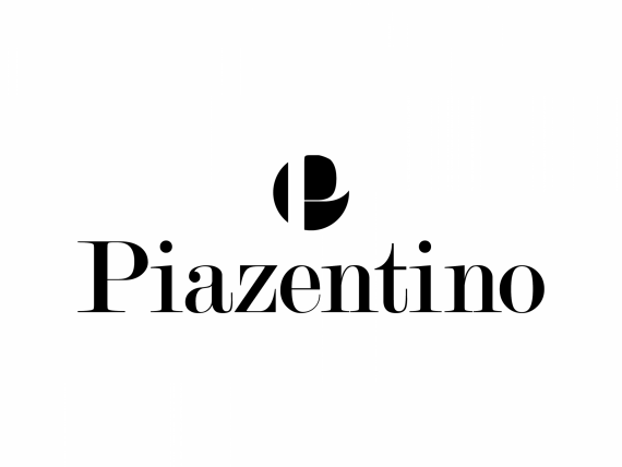
I don't know what that symbol is supposed to be, so I really cannot comment on it, besides the fact that I don't think it works.
You have your work cut out for you. A logo for a Design Agency needs to be the absolute best logo possible to attract clients.
This has no potential at all, sorry. Scrap it. Start again.
You need to brainstorm what your company stands for, what you want to represent, how you want to come across. Then, you need to sketch ideas. Then you need to research some good logos relevant to your field. Then you need to sketch some more. Then you need to refine, think, refine again. Then you need to sketch again.
Then, and only then, are you allowed to turn on your computer and use it.
Bring us your best 3 ideas, we will help!
PS. Don't steal things from online or you will get smacked!
I agree with waffles about not knowing what that symbol is..maybe you could give us some background? and I don't think you really have to scrapthe entire thing. I personally like the lettering, it's very classy and I have an idea of the direction you were probably trying to go but the symbol just didn't go with it...at all..at least from a blank perspective right now, maybe you could enlighten us? But i do agree you need to do a whole bunch of sketches to get the symbol in the right direction at least.
I'm sorry, you guys do realize that the symbol is a P in a circle, right?
To be honest, I totally did not see that! I can't tell you if it's good or bad. It makes me think of the Carrefour logo, which is good, but I can't help but think it's a little bit simplistic since you just took the P of the word mark and put in a circle.
Globally, I think you can push this way further.
I have literally never realized that the Carrefour symbol actually is a C. I always focused on the blue inside the C as the symbol itself.
That's exactly what's going on with your logo. It could be a cool thing if you can push it further and take care of all the small details that makes it look a bit unfinished for now.
I'm not the maker of the logo, haha :p
Well pass it on to the designer who made it then.
I don't think this person is speaking for the designer, they probably just chimed in to point out that there was a P in the circle, which I thought was pretty obvious anyway.
Oops =)
Oh, there is a P.
I honestly thought it was a cut up slug or danish or something.
Right there with you WAFFLES LOL I honestly cant believe I didnt see the P!