Pizzaria Cubo Mágico
Higor Érick | Wed, 04/02/2014 - 19:25
Brief from client
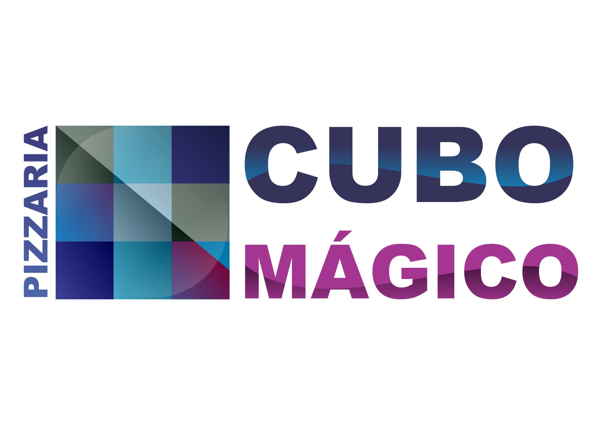
A meta deste logo é de destacar a pizzaria das demais que existem no mercado, fugindo um pouco do clássico e tradicional, usando referências mais jovens e enérgicas de um ambiente mais alegre e descontraído, diferenciando a empresa das pizzarias comuns com uma identidade totalmente única e com um público mais abrangente.
A escolha das cores foi do Azul e Lilás, mesclando ambas em um logo com uma imagem clássica, mas, com um ar jovem e contemporâneo. A escolha da cor azul foi por sua transmissão de segurança, tranquilidade, serenidade e harmonia, o céu e o infinito, muito associado como a cor da realeza. A Lilás simboliza respeito, dignidade, devoção, piedade, sinceridade, transformação.
3 Comments
No es bueno. This will never work for you without being full color. It doesn't have anything visually that relates it to pizza. The gradients everywhere are just fluff and they don't help. It's way too complicated in all the wrong directions.
Step back from this and really visualize. I get that you want to be nontraditional and modern but your logo still needs to be able to communicate the subject matter and hold it's aesthetics in it's basic one and two color forms. Lose the gradients ans start with solids. You can always make a deluxe version for special uses later. Good luck to you.
I agree with Jon. This is not working at all. It looks like you did what you felt like doing rather than what's needed to be done.
Also, ENGLISH PLEASE.
Gracias.
( sorry I know this is portuguese and not spanish ;D so i don´t speak it) What they said above, however, it´s true... cold colors are not really good in food related logos unless it´s part of the name or concep or it is about grapes and bluberries, or curaCao. However if you want to keep the use of blue and violet you probable want to use somethin more organic, friendly and even playful...
this look like a museum or architectural something.
think it through and start all over again.