Powers Maxwelle'
csbowden | Fri, 02/06/2015 - 19:16
Brief from client
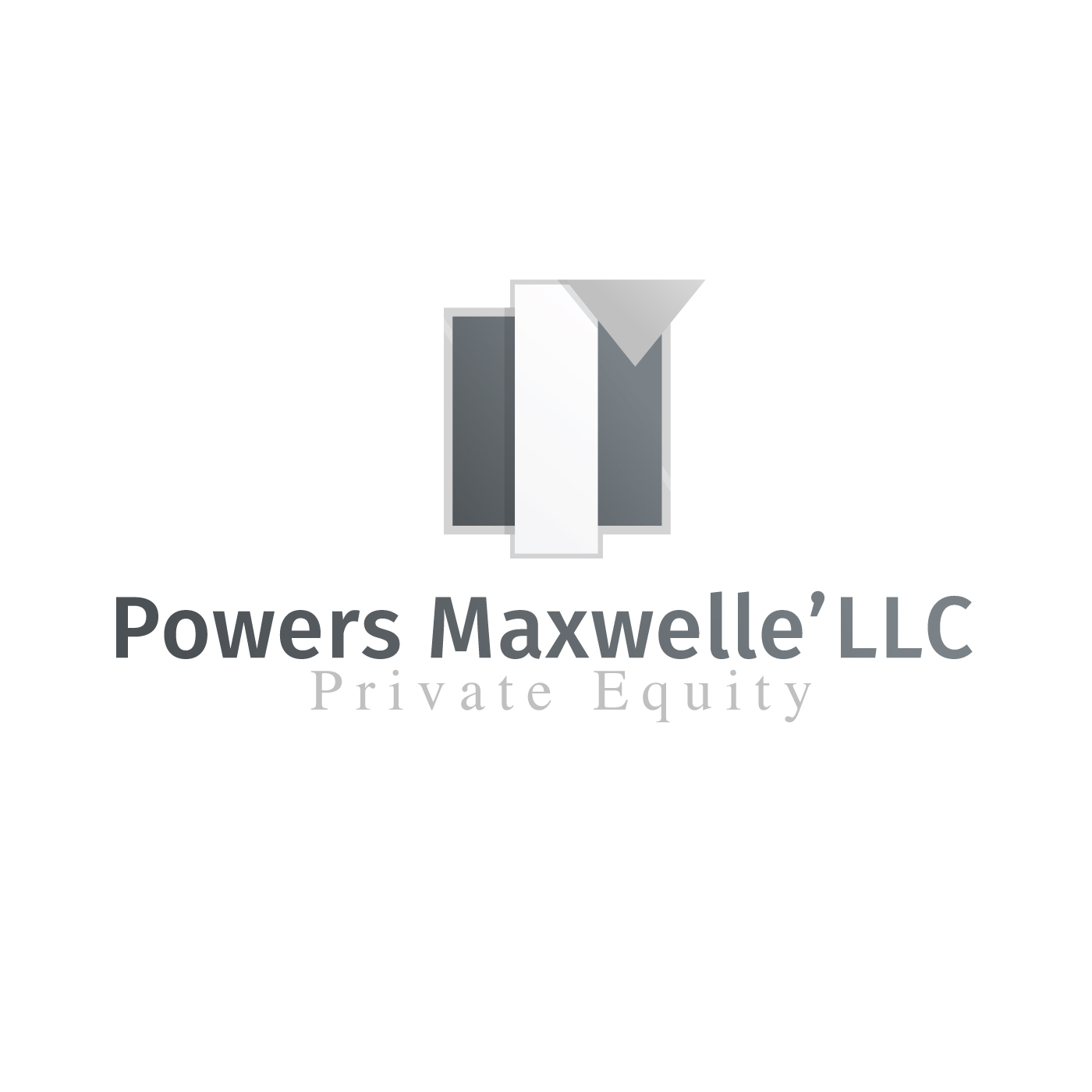
Private Equity Firm based in Cleveland. Wants to be modern and sleek with silver and gray as the colors of choice.
After looking at a lot of the different critique going on, I thought it would be good to post my own project to get some great feedback. Currently I am the only designer in an Architecture/Entrepreneur's firm. Powers Maxwelle' is one of his companies he is starting. After many attempts of creating something that works and not getting any feedback from my boss. I need some kind of critique. Which is why I came to you guys. Any direction is better than the one I am currently in.
4 Comments
Can you explain what the symbol is supposed to be, particularly the triangle on top?
As far as the typography goes, I'm not a big fan of mixing typefaces, especially serif/sans serif. It can work sometimes, but maybe it would be best to stick with one or the other.
It would also help to add a shade or two of color to make it more noticeable.
Okay, so for each of the companies, he wants an "r" mark as such that resembles something from his architectural style which draws inspiration from Constructivism. I'll definitely try keeping with one typeface and the adding of shades. Thank you!
The top of the r in the logo part reminds me of a flap of paper or a ribbon being folded over, maybe you can play around with those shadows/gradients.
Be careful using too many shadows and gradients, especially in the text part. I have worked in print and sign shops and when using gradients or shadows it limits your signage possibilities, or just ups the price. I would keep all the words the same color and either both serif or both San serif like you discussed above. Then you can focus on the logo part standing out with silver and having gray accents. Good luck!
Thank you! The main problem I have is just looking at it for so long without any external feedback. I'll fix it and repost it once I get a chance.