Printco
cortnywhite | Thu, 05/16/2013 - 19:04
Brief from client
Slogan: More than ink. A mid-size, but growing, offset/digital/web printer with nearly all in-house services; include print, bindery, fulfillment, direct mail and design departments.
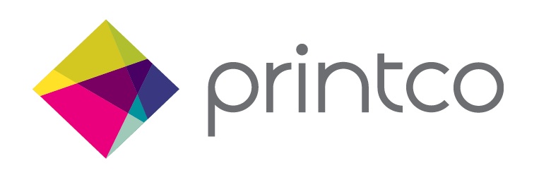
Maintaining the previous logo's diamond shape and multi-colored platform, this updated version gives internal structure and
balance. Many parts come together and balance each other to make this mark so strong. Versatile, modern and uniquely Printco. We are a friendly, approachable company that does a lot and is going places.
4 Comments
yea i like this, nice and professional. I would suggest you chose a different colour on the text though, the grey is a little dull. Maybe just black to give it a bit more prominence. Have you tried different fonts? i do like the one you have but i feel like there may be a better one out there more suited to your symbol with sharper edges
I like this!
como que faltaría integrarle un poco mas el nombre, está muy distante...
that's a nice approach to the CMYK thing, like it very much and it's very in trend. But I'm not sold on the font, sorry.