ProKick Challenge
simondry | Tue, 11/13/2012 - 08:07
Brief from client
Create a logo that visually represents this fundraising activity (that involves kicking a ball into a large goal that measures the speed the ball is travelling). The logo must have a visual link to the logo of the parent organisation SC Foundation (see www.scfoundation.org.uk).
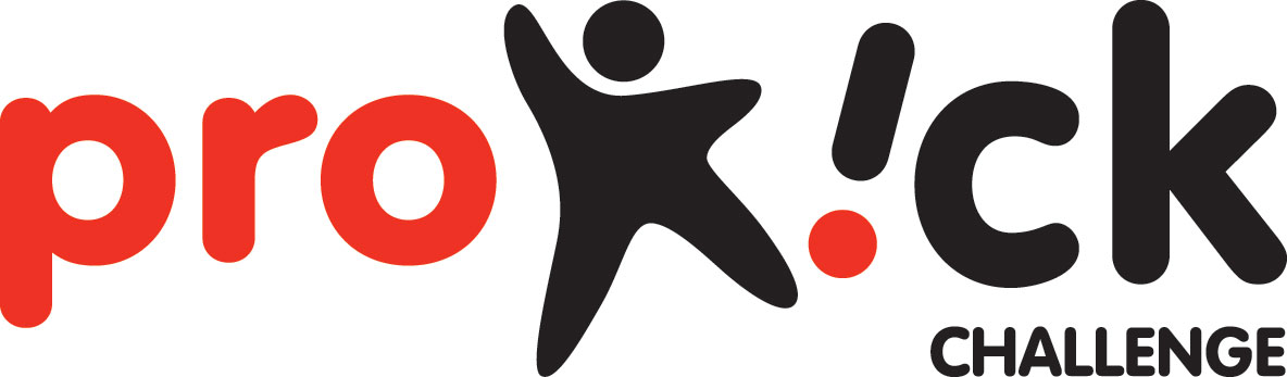
The little figure in the SC Foundation logo is extracted and used as the 'k' in the prokick logo. The figure has been redrawn so that it appears to be kicking the 'i' so hard that it has turned upside-down, thereby making the dot of the 'i' become a ball.
6 Comments
This is looking good.
The font reminds me of thee plastic letters with magnet we used to have on the firdge when I was a kid =)
My only reserve would be about the colors. They're not really uplifting and are a tid bit too serious for this kind of client. You should try different matches.
Good work!
I did a logo very similar to this several years ago, only the figure is doing a cartwheel instead.
Obviously, I like the idea. Not crazy about your choice of font.
For the most part I think this is great. I like the energy of the symbol, I don't hate the font (although I don't love it either) and I agree with Shawali about the colors. For such a fun company with a fun name the colors should be more.... fun! Black and red are so serious and kind of a downer.
PS- Rose, your logo for Prokids is awesome!!!
The logo is alive but the colors are dead. Change colors with something more vivid....
I read this as Pro ick, so it doesn't really work for me. I don't care for the type either, it seems a bit boring. I'd suggest something with more energy, like Rose's
I realy like it.