Puerto Rico Weddings 3
Brief from client
-The challenge is to keep it contemporary and luxury yet wedding-y and tropical. It could also have a bit of the spirit of the Caribbean and Latin flavor of Puerto Rico, ideally.
-No cartoons, clip art, or juvenile feel.
-The words might say enough about weddings without including 'traditional' wedding iconography. I don't like adjoining wedding rings, or hearts, or hands (unless very abstract and contemporary) or any of the traditional wedding iconography that always looks cheesy.....so I'd rather not include.
-No literal cliched island iconography like palm trees, seashells, and waves. Abstract and contemporary and creatively clever versions of this might work, but they must be special.
- Also, I think it's probably best to spell out Puerto Rico (instead of abbreviating it per the URL), per my current home-grown logo.
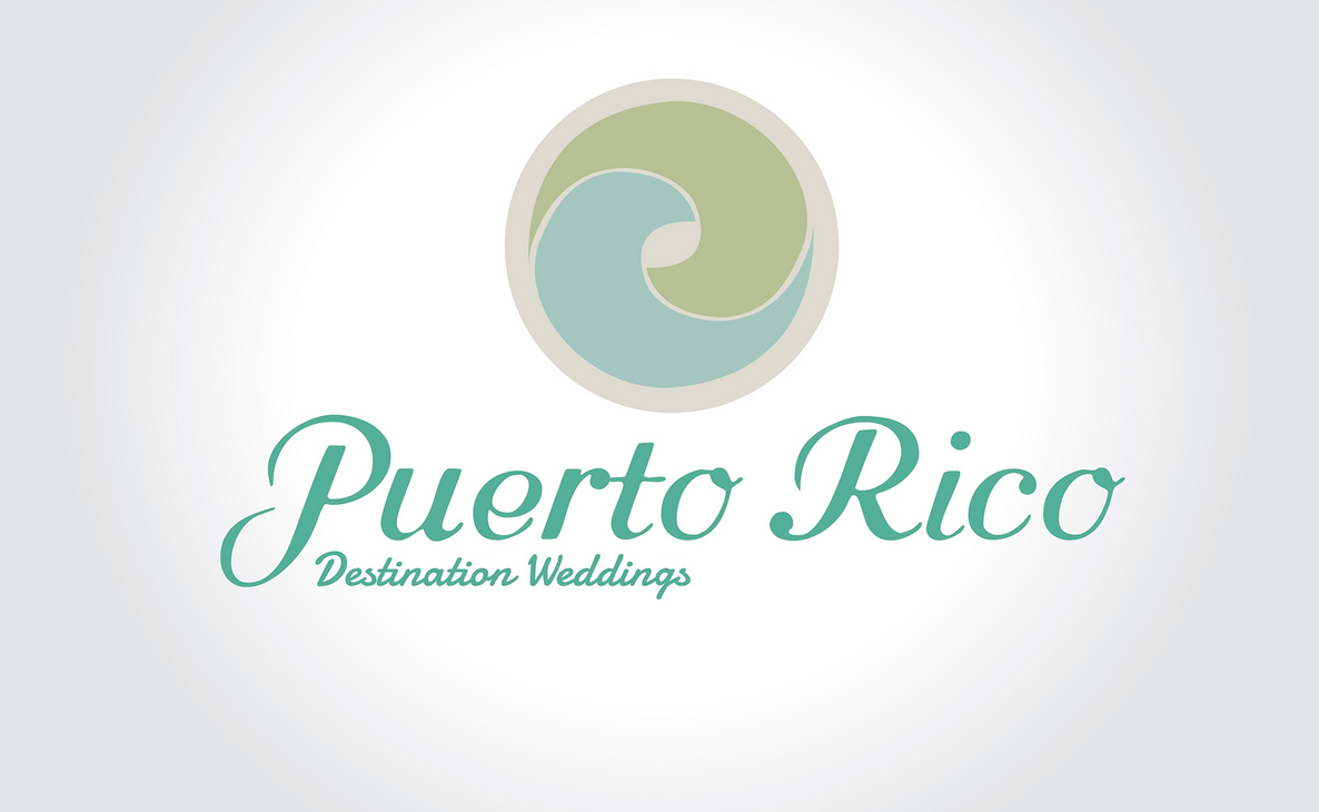
The symbol is an abstracted version of the Taino (native culture to Puerto Rico) symbol for water. This is a solid symbol that can be used as a monogram or icon. Very recognizable and works well in small sizes and in grayscale. Fonts are flowing and elegant. Again color palettes work well in aquas and neutrals. Wondering if maybe the symbol is a bit too heavy for the light fonts underneath it? I thought making the symbol with very light sea breeze colors might help that out.
7 Comments
I like this version the best. I would remove the circle behind the symbol, or lighten it, it reduces the contrast and makes the symbol harder to see clearly. Also, the symbol size might be just a little too large, maybe try reducing it by 10-15%.
The subcopy should be a little larger also to make it more readable, and centered.
I think this design is going places, just a few small revisions and you've got it.
Thanks! You're right. The symbol looks much better smaller and without the circle.
I like this one the best. I wonder if it would look good to space out the letters on the second line, sort of like this to match the width of the company name:
D E S T I N A T I O N W E D D I N G S
Edit: The page won't retain the formatting when I save this post, but you probably get the idea.
Thank you! You're right I like it much better this way. I changed the font since the other font was meant to flow together touching and didn't work well being spaced out more. This one still has that flowy script feel, but is much more clear when spaced out.
This is looking pretty good and evebn better with the latest revisions.
One thing that bugs me is the bad kerning and the absence of ligatures! I know that free cursives don't come with them, but you can always create them yourself. It can be tricky at first, but it's a great exercise!
Keep it up!
The absence of ligatures is something I have literally never even noticed until just now. Wow. Welp, my eyes can only get sharper and more attentive to detail as I go along!
I think colors on the iso are not the best combination for the color on the text. Did you try using all colors saturated or all colors desaturated?