Puertos Maritimos de Honduras
menchis | Wed, 02/26/2014 - 16:48
Brief from client
The client is the goverment. They are in charge of making bigger the most important port in Honduras and later on they will be checking that everything that the country imports and exports goes as planned.

Puertos - Port
Maritimos - Maritime
Honduras - the country
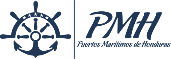
My design is basically representing every word from the company. Port represented by an anchor, maritime with a helm and Honduras since the flag has 5 stars so I represented it that way. The color of the logo is blue since it defines water and the Honduran flag has the same color.


4 Comments
I think your symbol and idea behind it are very nice but this looks like two separate logos. I'm not sold on the main font but if you stick with it I think you should have a simpler font for the subtext. I would like to see where you go from here.
Excelente! Me encanta el símbolo, el timón y el ancla están muy bien combinadas . Yo también vería que otras fuentes se pueden usar para el subtexto porque es la única observación que haría, bueno , eso y que cuando exportes tus logotipos les dejes el espacio de aire correspondiente y evites esa linea tan fina de contorno que resulta molesta.
Hola hermano al igual que JonAtkinson y DeaDraco , pienso que el simbolo es muy bueno lo unico que observo y comparto es la opinión de JonAtkinson es que parecen dos logos distintos, trata de simplificar la tipografía y quitar esa linea de contorno y la que divide la tipografía del símbolo.
soy de honduras y lograste representar a honduras con el símbolo, muy bueno saludos.
Hi brother I share the opinion of JonAtkinson and DeaDraco, I think the symbol is very good, the only thing I watch and I share is the view JonAtkinson is that like two different logos, tries to simplify the typography and remove that line contour and dividing the symbol typography.
I am from Honduras and Honduras did it represent a symbol with very good Greetings.
Sorry for the English