RabBit
jonah64 | Tue, 01/14/2014 - 19:00
Brief from client
1- Use a rabbit on logo image.
2- Use the name to show tech.
3- Logo must show technology, royalty, strong and quality.
4- Simple and easy to remember.
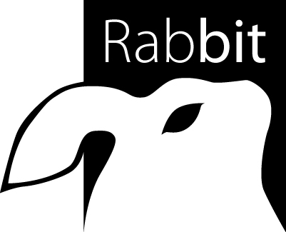
This logo is for a computer device company, its will be print on mice, keyboards, pads, and maybe on UPS units.
8 Comments
the line weight in the ears changes and it´s not very fluid, looks a bit odd. the diference in font weight it´s also not that good looking, think of other way to make "bit" stand. And the bunny looks fat. sorry
Thanks you, really i need to know whats going bad to refine or make greater the design.
Thanks you agains!!
Unfortunately, this logo shows neither technology, royalty, strong nor quality.
What it shows, thought, is that you didn't spend too much time working on it, let alone sketching a few dozen ideas before going to the execution phase. You should have drawn a few hundreds rabbit for the symbol itself.
It is also not simple. It's simplistic. Simple logos are the toughest nut to crack.
My advice is to restart from scratch, get a lot of inspiration first, then, when you're all fired up, sketch, sketch and sketch again. Illustrator is just an execution tool and should be use only in that regard.
Good luck.
Does not look like a good logo yet. It lacks the tech look and it requires some balance. As Shawali said, you need to explore more ways of having the rabbit it a way that reflects what you want. Good luck.
If it's a Chinese mouse, and it doesn't matter it's ok. But I feel that you are striving for perfection if you ask for a critique. It looks like a rabbit slapped by some stick with an eye open. Both playing with typeface boldness and the logo shape is a bit too much in my opinion. The color is very good. Why nobeody said that?
I suggest following steps:
1. Sketch more on paper.
2. Separate the text and the rabbit parts.
3. Look for inspiration on sites like http://logopond.com/
4. Go back and sketch again.
5. Make a screenshot of the logos you like, of some well designed brands and in your design software (Photoshop, or other) insert your Rabbit logo.
6. Look and compare. What makes other logos catch your attention, and on the other hand what makes your logo composition weak.
7. Rest.
8. After that with fresh ideas go back to work and make a final draft.
9. Upload it again for a critique. It should be a masterpiece by then.
Hope it helps.
Thanks for all, yours criticism has been helpful to me.
They have made me se that i need to try harder and i have much to learn still.
Thanks a lot.
This is a great place for that. Take your time and don't skip the details. Best of luck.
Thanks you pal.