radical one
Leo Cardona | Fri, 05/15/2015 - 09:11
Brief from client
Terpel brand motorcycle lubricants segment of Colombia
registered but currently not in use
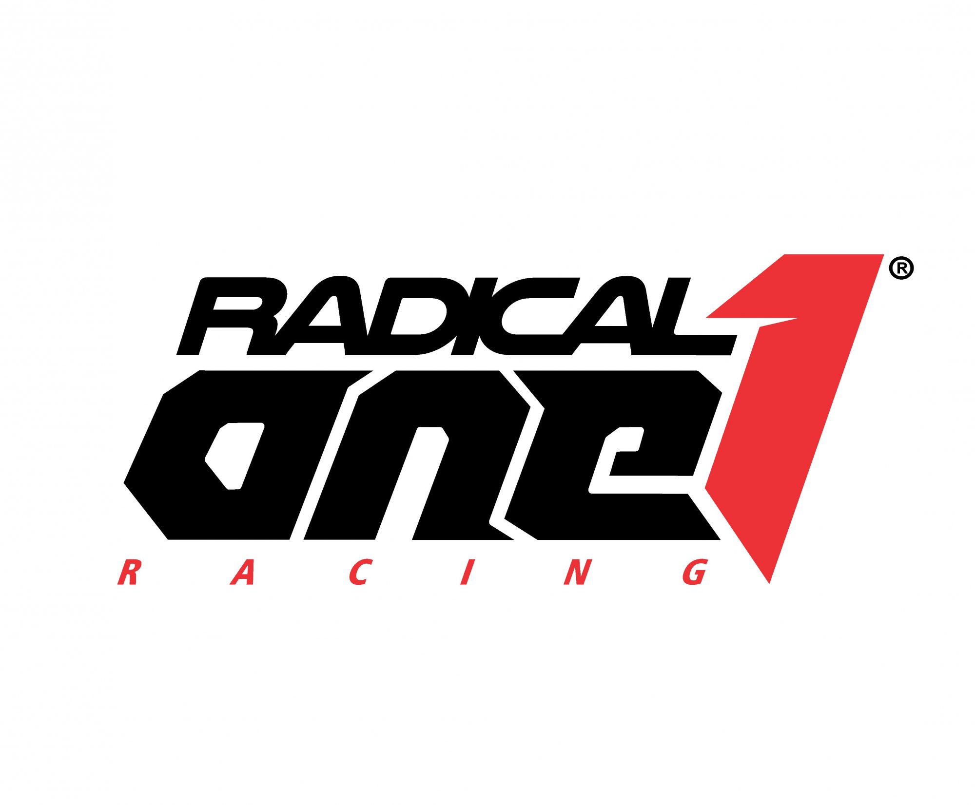
brand subsidiary for motorcycle lubricants and racing team
Terpel brand motorcycle lubricants segment of Colombia
registered but currently not in use
brand subsidiary for motorcycle lubricants and racing team
14 Comments
I read : " RADICAL ANE 1 RACING ". You must reshape " ONE " part to make it more readable. I would make " 1 " out of a negative space in " N " and ditch a red " 1 ". " RACING " needs to be bigger. I would like to see more vibrant colors and more dynamics into a composition. At the moment nothing here says about lubricants nor motorcycles. I like it anyway...
you're absolutely right, and had seen the problem of legibility .
1 think it helps strengthen the ( ONE) in a mainly Latin American Markets .
the next step is to simplify and left only ( 1) thanks for your help
This is looks globally ok, but I agree with Bapota that it reads "Radical Ane 1". You need to fix that.
Otherwise, this a pretty solid effort.
if that's the idea that it is a multifaceted brand in the market of motorcycle competition, as ( fox head) or ( alpinestars ) apparel brands globally known and not necessarily
related to motorcycles in their charts. I appreciate your support
thanks
I think the logo works. Maybe if you tweak the 'o' and 'n' slightly as I have in this example it would solve the above issue.
i like so much the O the lower part of the N imnot sure about , It looks like it opens sideways.
thank you very much for your help
I have done this version for you - what do you think? Also, I had an idea to make a half of the " O " in " ONE " round and make a few streaks coming out of the motorcycle's wheel as they burned a tires sometimes before the race starts...Good luck in your logo!
BOPOTA good point, looks much better.
Thank you, Cesar. I was, also, thinking to add tire tracks texture into that to tied up to a motorcycle business. How are you doing on your logo for Panama store online, by the way/ Are you making any progress? When will you post a finish version? I' be been very sick since Thursday - coughing my guts out... What would you recommend to get well, Cesar?
I've been busy with other things but I'm already thinking of new ideas.
My client liked version two but I was not satisfied so I decided to propose a new version.
I think that on this version an " n " much better integrated with " e ".
And now with a Colombian colors...
great colors to my flag. but very difucult to convine with other colors.
Looks good to me, got nothing to add besides what is mentioned about the (one) and making (Racing) a bit bigger.