Radio Gorillas - Model Aero Club
santosmont | Fri, 01/10/2014 - 14:55
Brief from client
Appellative and amusing
Easy to read
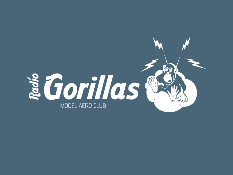
Logo for aeromodelling club based in Portugal.
Appellative and amusing
Easy to read
Logo for aeromodelling club based in Portugal.
10 Comments
I like the logo but i feel you are loosing the detail in the gorilla, i would simplify that so it can appear sharper.
Your tag line to me feels randomly placed. I would adjust that to fit better as well, but overall i like :)
This is a good logo, but its a bit too much, To simplify, I would just keep the mokey's head with the headphones and lighting bolt on and then I would use a font thats simluair to radio flyer, everything else goes
Great idea, style and drawing. I agree with what's been said. I'd also place "Radio" horizontal and slightly bigger. (maybe place it between the G and the dot in the i?)
Sorry to be the bringer of bad news, but this logo isn't working at all.
First it's certainly not easy to read. Always avoid having vertical text in a logo. It just messes with the sense of reading and complicates the whole thing needlessly.
Then, the symbol. Did you do it yourself? It's cute all and all, but what does it have to do with aero modelism? It's just a monkey listening to the radio. A bit to vague. To be honest, it looks like a clipart you picked up on the internet and stuck there. Even if it's not, it doesn't convey any idea of what this radio is about. In addition to that, it's overtly complicated, with the 4 lightning thingies plus the one the left.
Lastly, the font. It's a terrible one. The Hard Rock Café font (or Aadrvark) is way too recognizable because of the Hard Rock Café logo, but also because it's free. It's used by every student and beginner in graphic design (and god knows I've been one). It basically makes your logo look cheap and amateurish. Avoid it, like 99% of the types on DaFont, like it is the plague.
I'd restart from scratch, with pen and paper in hand. Always sketch before using Illustrator or whatever you use.
Good luck.
The "monkey" is a "gorilla" (two different things) and is not a clipart but a squadron mascot taken from a photo (that my client gave me and makes sure to use it) from an old airplane (Douglas O-38) that had painted on the fuselage. For me it's okay, its funny, with some humor, proper for what is proposed; Model Aero Club, a place for meeting with friends and their children in a flying field for fun on the weekend. That's why the founder call it Radio Gorillas. And also if the mascot has the headset with lightning thingies, for me it's okay too, it looks like is receiving radio signals.
About vertical text I agree, is not suitable for a logo, but more suitable as a title of a newspaper or magazine news header. In short I am restricted to what was delivered and told by the customer, including the font, I had no room for creativity, and if it looks as a cheap logo is because it is, once the client already had in mind a decision. I just wash it and convert it for vectorial.
About the font just because is very known, by Rock Café Logo, for me it seems be more a comic style font taken some comic book headline. The client also asked to use this font, anyway I told him about that to try avoid it, nothing but a pencil and paper to resolve it once for all, I'll draw new one, more appropriate and original.
Anyway thanks for all comments. Truly is an useful help.
So you got no say with the symbol and the font? That must not be really fun =)
I get the symbol thing. What you could at least is try to find a way to make it look like it's actually painted on a plane.
I agree with Shawali
Too complicated. A logo shouldn't be like an illustration.
I'd stack it. Put the Gorilla on top, maybe a little bigger so you can see the detail. Can you thicken the strokes a bit on the finer details (lines in the feet, etc)?
I like Jefzor's suggestion of putting Radio over Gorillas, between the "G" and the dot over the "i". Center the subcopy, maybe make it a bit larger and spread out the letters with a wider kerning.
I know that's the Hard Rock font, but it didn't bother me at all. Didn't even notice it until someone pointed it out.
If your client is set on using the monkey illustration, maybe try to convince that it would be better served as an info graphic somewhere down the road, maybe on a website, business card, or apparel. I would focus on the typography first, that's your main message. Everything else is secondary. I think creating a wordmark for the logo would be a better way to go.