Brands of the World is the largest free library of downloadable vector logos, and a logo critique community. Search and download vector logos in AI, EPS, PDF, SVG, and CDR formats. If you have a logo that is not yet present in the library, we urge you to upload it. Thank you for your participation.
For an amateur, you're better than a lot of the professional logos I've seen.
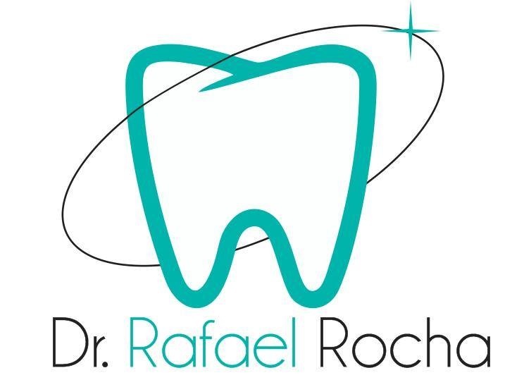
However, there are some rookie errors. The centering is a bit off and the kerning needs a tweak or two. You'll have problems when using this in the future, due to it's proportions.
The colours and Icon are good, maybe the black is a bit too harsh, so a grey or dark blue might be better.
I think the ring with sparkle is a bit over used for this kind of thing, so I would experiment with the tooth on it's own.
I would also experiment with different type.
Also, start again with a pencil and paper and see what happens.
Yeap! above. You have a pretty good basic idea, but your need make something less generic, and be more bold!
All the dentist have the same type of tooth in your logo, you need make the difference, you need make your own style, be more that others, swim versus the flow.
Very true, you can tell you have talent for a rookie, you have to pay attention to the fine details that is what really sets you apart from people. even designers that have 15+ years in the game still make rookie mistakes with spacing and fine details. im sure you will have a good future in this.
keep at it!
6 Comments
For an amateur, you're better than a lot of the professional logos I've seen.
However, there are some rookie errors. The centering is a bit off and the kerning needs a tweak or two. You'll have problems when using this in the future, due to it's proportions.
The colours and Icon are good, maybe the black is a bit too harsh, so a grey or dark blue might be better.
I think the ring with sparkle is a bit over used for this kind of thing, so I would experiment with the tooth on it's own.
I would also experiment with different type.
Also, start again with a pencil and paper and see what happens.
Thanks!!! To your opinion, hints and the praise, i will see what I can do with your hints!! Thanks so much
Yeap! above. You have a pretty good basic idea, but your need make something less generic, and be more bold!
All the dentist have the same type of tooth in your logo, you need make the difference, you need make your own style, be more that others, swim versus the flow.
Good Luck and sorry for my bad english!
Thank you so much, you are right I am so happy because you give me hints!! Thanks, I am brazilin and I domt have a good english too hahaha
Very true, you can tell you have talent for a rookie, you have to pay attention to the fine details that is what really sets you apart from people. even designers that have 15+ years in the game still make rookie mistakes with spacing and fine details. im sure you will have a good future in this.
keep at it!
Thank you so much to trust in me, and to your opinion, thanks!!