Ramona & Hank
mcbaron | Tue, 07/10/2012 - 14:58
Brief from client
create a logo for a wedding
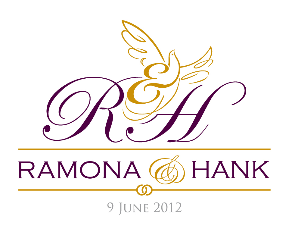
monogram logo I created for a wedding this summer.
I modified the real names for this upload - but the original initials
are R&H.
create a logo for a wedding
monogram logo I created for a wedding this summer.
I modified the real names for this upload - but the original initials
are R&H.
1 Comments
First things first, I DO like the idea of creating a dove out of the ampersand- that's great. I like the purple color, but I'm always weary of doing golds like that because a lot of the time (unless you're getting this stuff done on a two color press) golds come out either too dark (ie- brown) or way too light (ie- yellow or brassy looking).
The only thing I'd change about the dove itself would be to maybe remove those bottom two lines!? I think it would work and maybe look cleaner without them.
I like the details you've adjusted within the initials (like the line of the H being curved to fit the bottom of the dove) but I'm just not sure it that the typography in general works well together. Are the two lines (the ones above/below Ramona & Hank) the same stroke weight? The top one kind of looks thinner... But I like the joined circles on the bottom line. I think that might be copperplate that you're using for their names (!?), which I'm not a huge fan of but I know that a lot of people like it. Maybe it would be worth trying out a few different fonts that aren't used so often for wedding stuff- it might make yours stand out more.
Last thing! I'd also change the gray font at the bottom to either be light purple (like a screened version of the purple you're already using) or just regular purple. It disappears at the bottom and doesn't look very nice next to that gold.