Raphael Web Designer
Raphael Martines | Tue, 09/04/2012 - 03:13
Brief from client
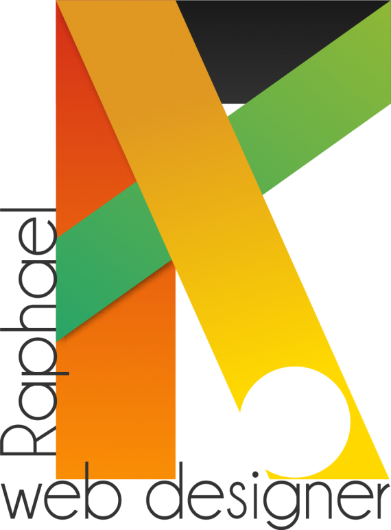
The geometric shapes represent the drawing. And the colors are based on the Brazilian fauna that is very rich in color.
I found it interesting mix square shapes with rounded fonts.
This is my personal logo!


6 Comments
Like the idea and the type and the overall layout. I understand the "R" in the shapes, but not necessarily the circle. I like the colors although I'm not usually fond of effects such as gradients, or drop shadow. What if you created more of a twisted ribbon effect with the top of the "R" to create a softer shape to go with the straight lines.
Thanks for the criticism, the circle does not really have a definition, it just comes down to the font used. Maybe I'll be climbing another version soon!
Thank you.
I think I like the idea you're working with here, but I don't think it's coming together as well as it could.
First, I wouldn't put your name reading vertically- you want your name to stand out first and foremost, so it should be right reading. Right now "web designer' comes across before your name does, and that jus' ain't right!
I really do like the colors that you've chosen, I think they're unique and a nice combination, but (per usual) I worry about gradients for printing reasons, and I'm not sure you need/should use the drop shadow underneath the green shape. If you can think of a way to take the gradients out but maintain your colors, that'd be swell. Easier said than done, I know.
I'm not sure why you've taken a circle shape out of the leg of the R (is that supposed to symbolize something or just for fun?) but in any case, it kind of gets lost because of the light yellow color. If you keep the cut out, should you maybe change the color of the block it's taken out of so that it shows up more? Or maybe just take the cut out away altogether?
Lastly, I'm not loving the font you chose for your name and title. I'm not sure if it's Century Gothic or just something that looks like it, but it's just so thin! Maybe toy around with other fonts that aren't so meek!?
Anyway, I look forward to seeing other revisions!
Thanks for the tips and critiques, I'm still not getting 100% like this soon, but I'm slowly improving it. Have noted your advice, maybe I'll soon be climbing a new version!
Thank you.
I don't like it at all. It's messy and confusing. Keep it simple.
Make it SIMPLE, it's good, but not too much, try to fix it.