RCA Consulting Services Inc.
Brief from client
The focus is on assisting schools with federal meal programs and providing nutrition education training and corporate work-life balance programs. The client liked the colors red, green, and black, and they were interested in a "moderate" design (not too plain, yet not too bold, they said) with some sort of incorporated symbolism.
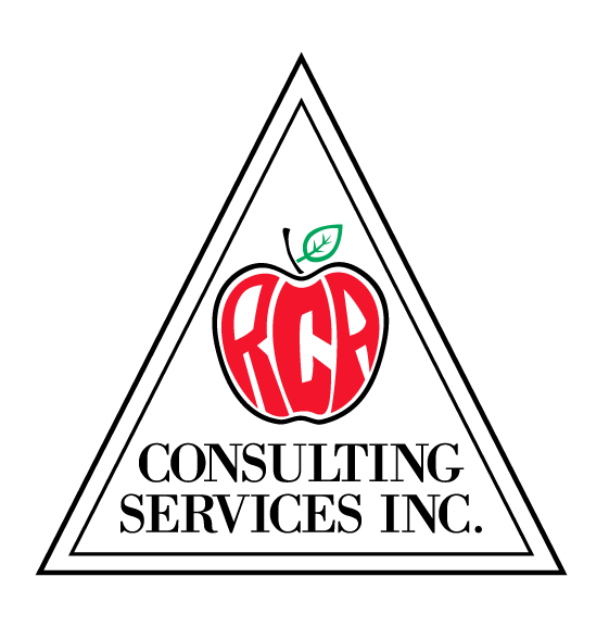
I immediately thought "apple" upon reading the brief sent to me. Not only does one usually think of apples when they think of schools and education, apples, as a fruit, also signify healthy foods and nutrition.
At first, I simply had the RCA apple above the text, and it looked strange. I was going to frame it in a square when I looked at the way the two items were centered and thought triangles. Food pyramid!
Anyway, this is what I have thus far.
2 Comments
This is way too dated for me. Looks like it comes straight from the 70's.
Also, I think the triangle us superfluous. Don't really say or add anything, it just complicates the whole thing.
I'd keep the apple idea, but try to make something more actual.
Good luck and have fun!
I think the apple speaks to what you are doing, but I don't think the triangle is doing anything to enhance the logo. I would take the apple out of the triangle and also look at changing the typeface of the text. Possibly a modern sans serif?