RD
Poeshh | Tue, 01/06/2015 - 11:53
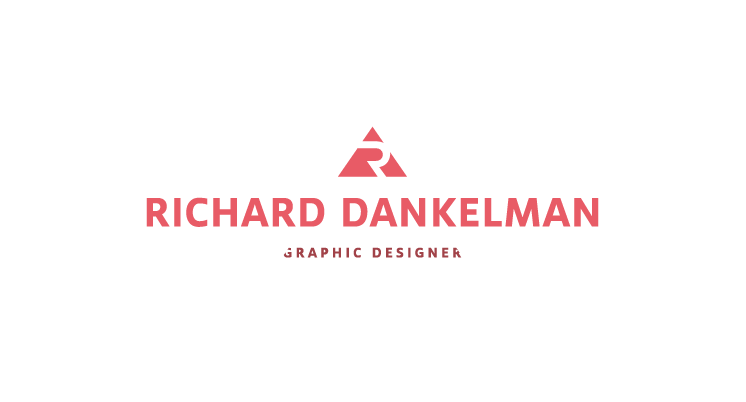
Brief from client
Hello, I'm a graphic designer and here is my logo. I've made so many logo's for myself but I'm never satisfied. Maybe you guys can take a look for some tips. I have something with triangles, don't know why.
9 Comments
I agree with Shane. Looks fine but the cropped out G et R make the subtext read "raphic designe".
You can easily extend those letters too without losing your visual effect. No one's going to take a ruler and check to see if it's a perfect triangle :)
Thanks all for the feedback. I extended the letters and chopped less off the G and R so its better readable. The font i used was Avioflex-Bold.
Sorry, by extend the letters, I meant to reduce or eliminate the slants. The size they were at before was much better.
Either do that or increase the triangle size a notch or two.
You could use the full text of Graphic Designer by reverse it in a box with slant edges to match the top triangle. You would probably have to enlarge to top triangle to hold balance..something like this...just a thought.
Thanks, this is what I have now. One with and one without the slants. Cooperads that one is also a good idea, but for me it doesn't work. But thanks :).
For me, you're better off without the slants. They don't really serve any purpose and are gimmicky at best.
The primary error that you have made here is that it appears as though you have just sketched the outline of a pigeon. You cannot simply copy and paste the content from another source; rather, you must build the thing on your own. https://melonplayground.io
It took me a little while to read all of the comments, but I found the article to be quite intriguing. https://totalincrementalwar.org