Brands of the World is the largest free library of downloadable vector logos, and a logo critique community. Search and download vector logos in AI, EPS, PDF, SVG, and CDR formats. If you have a logo that is not yet present in the library, we urge you to upload it. Thank you for your participation.
Version history
Version 1

- I
- S
- T
- C


4 Comments
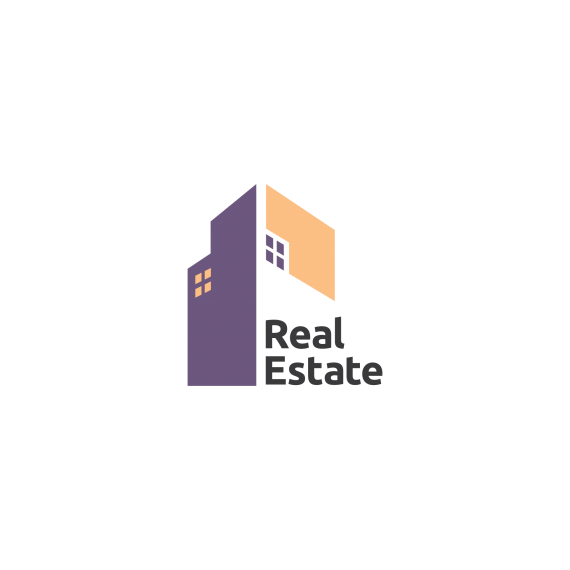
The windows are better, but the ones in the purple are still not aligned with the roofline.
I really like this. The idea, colors, and font are all good. But as coop above pointed out, things aren't lining up right. Your perspective is wrong and it upsets the balance of things.
If you draw a horizontal line along the bottom out past the logo, then draw diagonals out from the peak to that horizon line, you find your vanishing point. All parallel lines should be bent toward that. I've drawn some lines over your logo to illustrate, below.
If you can clean that up, I think you've got a winning design.
Come to think of it, wouldn't those types of windows better suit a residential home? I might simplify into larger squares for this style of building.
The cherry on top might be to make the L in "real" end exactly where the side of the building ends, for alignment purposes.
My exact thought also. Both concerning the windows and the alignment of "real".
Also I'm not really sure what I think of the color combinations. I thinking It would look cleaner if the text would be in the same color as the building itself. Either purple or turquoise, or a mix. I think the black somehow looks wrong.