Reclaim Water Services
Matt_B | Mon, 11/20/2017 - 19:47
Brief from client
Company that purifies the water that's produced in oil & gas extraction.
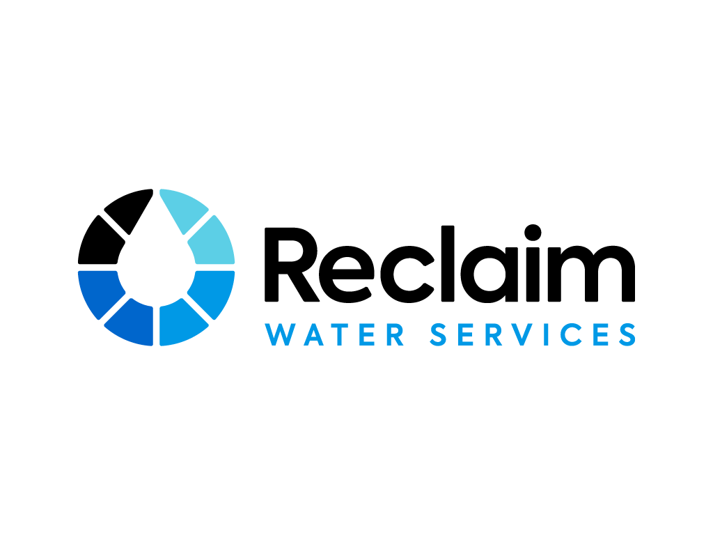
The reference image they provided was an image of their purification steps, showing water going from black to clear, & they wanted something to show this plus a general recycling concept.
So I came up with this stepped ring with negative space droplet, which evolved from versions that used smooth gradients, arrows & an overall droplet shape.
EDIT:
This is the horizontal version of the chosen design but I still might make some tweaks, although they're happy with the colours.
11 Comments
Watch out, you are allowed only 1 logo per post. You can add alternative compositions in the comment section.
got it, let me reupload...
I really like this. Just has a couple of issues for me;
Kerning is a bit off. For ref look at the spacing between e and c in 'Reclaim', and also take a look the whole of WATER SERVICES spacing wise.
Secondly, I think the symbol looks great but would be better in a single colour, perhaps the same as used in the type?
Oh and line up the symbol outer circle with the type rather than the drop.
I like this a lot. Every decision makes sense.
Going from the black to light blue to signify the dirty oil water to clean water is super smart. I also like the extended tracking on the bottom text to have the top text stack on it nicely.
The only thing id maybe want to see a version of is the type centered with the logo. It feels a little bottom heavy to me right now, so maybe that will help it feel more evenly dispersed.
@glitchmunki - thanks, the colours have to stay but I can tweak the rest. About the alignment, do you mean enlarge the text so it's all the same height as the symbol?
For kerning, I've tweaked Reclaim a bit below. Do you mean the wide tracking on Water Services looks off, or its kerning (which is just using auto settings right now).
@FleepFlorp I tried centering the text & you're right, it looks more balanced:
Putting a contour around the letters and objects is a smart way of examining spacing. I think I'm going to start doing it that way too.
I really like the symbol, it's simple and nicely symmetrical. My only comment would be that typically we look at a shape like that and follow it clockwise. Here it runs actually counterclock. Without flipping it in our minds, it runs from clean water to dirty.
Also, I'm not sure of the color values you have here, but each of the four colors ought to be 25% lighter than the step before. Looks like there's a pretty big jump between your darkest and the next one.
@Matt_B Yeh in terms of alignment the second version above looks great now. Overall tracking is fine too, it's the kerning on a couple of letters that is slightly off. If you look at the gap between W and A for example, it looks optically larger than the gaps between the other letters.
Something else you might want to consider doing is hanging the W in WATER SERVICES slightly over to the left of the R of Reclaim.
I think the gammas on my monitor might be iffy, need to look into that.
The idea about reading the dial clockwise is interesting. Tried it out with some extra blend colours:
This look so much better now it reads clockwise! Great job.
winner winner chicken dinner
VERY nice! My only comment is that "Reclaim" is written in the dirty water colour. Would it be better in a lighter blue? Maybe switch colours with "Water Services" ?