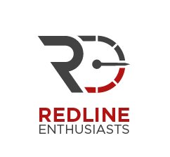
Redline Enthusiasts
KingWenzel | Tue, 05/10/2016 - 14:06
Brief from client
Personal project

This logo is intended to reflect a car-related community, mainly photography driven. I wanted the "R" for "REDLINE" to reflect a dynamic style and have a sporty feel. The tachometer (to reflect the redline idea) is meant to give a forward movement, hence the direction of the needle. I also spent a lot of time trying to figure out the best way to incorporate the "E" for "Enthusiasts", and the tachometer flipped as a backwards "E" was the best option I could think of. Any constructive feedback is welcome!


2 Comments
Sorry for the late feedback.
I see nothing particularly wrong with this logo. I think it works. This looks very well like it belongs to a car related business.
Good job!
I appreciate your feedback, Shawali!