Reel Keepers 2
Brief from client
None supplied. Got a phone call from the client. The company does video production, video editing, motion graphics, post production audio, accounting, bookkeeping and tax returns.
They said they specialize in "keeping--whether it's bookkeeping, documentaries or shot logs."
Since the business doesn't have a main product. I decided to categorize the business down to 2 categories. Filmmaking and Bookkeeping.
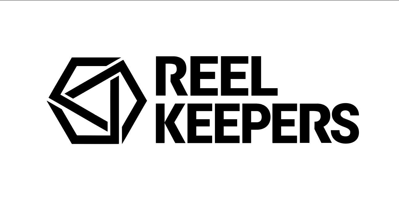
I did a bit of customizing of the fonts to keep it super clean and neutral--nothing fancy, but clean and easy to read.
This version is a pass at a totally generic icon. It's something that I happened to show the client and she said that she liked how she could see several things in it: a kite, a play button, and something that reminded her of envelopes.
5 Comments
Forgot to add: Critiques are welcomed (as always)!
Thank you!
I much prefer this version.
The symbol definitely has something and with a bit more work, it could be really cool and memorable.
Still not a huge fan of the font though. It doesn't fit so well with the symbol, me think.
Keep it up!!
I asked them if they were okay with changing their font. They are on board. I was thinking of something more like this. What do you think? (Also cleaned up the shape thing more)
Yeah forget about these, they look a bit too much like some 30's German symbol ;)
Very immediate, clean and eye catching