Reflection Spring
Katelin Kinney | Mon, 09/14/2015 - 00:51
Brief from client
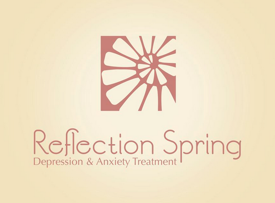
my own practice. Mock company is a resort/sanctuary for short-term or long-term stays for people struggling with depression or anxiety. Resort would have medical professionals such as therapists and psychiatrists, but I want to really focus on the calming oasis aspect of this business. Nature would be all throughout the brand identity. The logo is a shell shape representing taking steps towards self reflection and understanding depression.


5 Comments
I like colors and a text, but subtext needs work. I'm not sold on your symbol, sorry.
Can you be more specific as to what is not working on the subtext?
This is off to a pretty good start! There is definitely something happening here, with the symbol, the colors...
Now, the choice of fonts is good (these two compliment each other pretty good), but I really don't like what's happening with that F. Maybe it just what this particular font does, but you need to fix it. It creates a visual disturbance on the left.
And again, your composition isn't working. On top of the F thing, the subtext disrupts the centered composition.
This logo needs some more work, but good job so far!
Nearly perfect. Good work all around, very clean and professional. I like the unique typestyle of the main text (I personally like the interaction of the "F" and "L"), but I think you could do better with a different font in the subcopy. It seems left-heavy with the subcopy oriented where it is, perhaps centered, but lower so that it doesn't interfere with the descender in the "P" above it.
I like it, I only see a problem with F and L that small alteration makes the two letters form an A, you have to make some adjustments there.