Reggia di Caserta
danieleaq | Sun, 04/26/2020 - 01:23
Brief from client
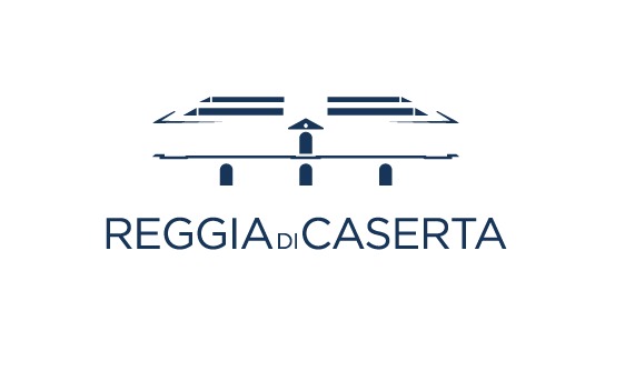
This is a my personal project. I want to restyle a Reggia di Caserta’s logo.
I want to rappresent the building in a game of negative spaces. Some tips?
This is a my personal project. I want to restyle a Reggia di Caserta’s logo.
I want to rappresent the building in a game of negative spaces. Some tips?
2 Comments
Interesting challenge!
Problem 1: Missing the outlines of walls, that's kind of what defines the structure.
Problem 2: The large arches look more like windows because the viewer has no where to reference the scale of the structure. I think the top arch is not the same type of structure anyway. I think there is a door or something in that one. The bottom 3 arches are actually gated or something like that.
You might try making all of the doors and windows as just the their basic shape. That would make the large arches seem larger and the windows and doors would flesh out the sense of the whole building. If you don't want to mess with the doors and windows, you could instead emphasize the columns on the structure. However, that would still leaves an issue of the arches resembling windows.
Then you could complete the outer shape of the roofline all the way around the front of the building by those blue lines touching the triangle on the front of the building. Invert the triangle, outline gets blue, interior is white. That completes the shape of the front roof line.
Next, take the roof lines on the sides of the building and extend them towards the vanishing point, stopping them at the end of the building. Now you have a better shape established for the roof. Next you could just hint at walls like you hinted at the roof before.
Hopefully, something in this feedback helps you creatively.
Keep up the work!
Molto meglio la seconda versione.
In questo caso di fatto è illeggibile, tutt'alpiù per il fatto che la reggia non viene certo riconosciuta per il tetto, che ad ogni modo è troppo in prospettiva.