residential project
Abbas Naqvi | Tue, 06/11/2013 - 14:58
Brief from client
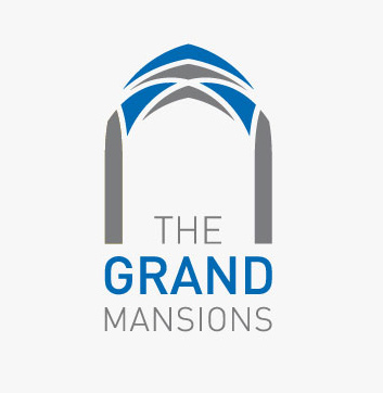
Client is to launch a high end residential project in downtown later this year. It's a one penthouse per floor development, very exclusive with each floor being about 7 thousand feet. Therefore the name needs to be catchy and good.
--
20 Comments
Really like this one as well. Only thing i would say is that the name on both isnt very Catchy nor original
I would use something like trajan pro for the main text, did you have try to not insert the THE inside the arc but in one line? Maybe it will look better. Like the symbol and colors except the second
Trajan would not match the bold icon work at all. There are better variants to use than Trajan aswell.
Spinnacer, i agreed what you are pointing but i tried Trajan even amaericana font but dosnt match with icon that is why i used DIN
ok, you can live even this one, I dont like the text infiltrate in the symbol in this case, I will see it alone
Great work, Love your comp.
I think I like the other version more tho.
You always do Great Work!
i thank you SF...
Overall it's nice. I think that the word "THE" is too tall. I would make it smaller and try kerning it out to reach the desired horizontal space. Does the symbol relate to the architecture of the building at all. If so, very nice. If not, it might be a little bit generic.
Neat. But I do not agree with your choice of font. Don't you agree that your icon is kind of formal where the font is more informal?
i agreed :) will change and upload soon.
overall is great
I think the symbol is very indicative to the type of residence you are going for but I do agree that the font selection could be played with. This font isn't bad but I don't think it is as fitting as some other choices may be.
The image reminds me of a temple or a mosque. Unless that's what your going for, maybe a little modification to the symbol would work a bit better. The name is sort of lame for me too. But that's just my opinion.
Keep at it, you're sure to hit a homerun sooner or later.
Peace and love.
I agree with most of the comments on here already. I think the Typography is the only thing lacking. Maybe try Perpetua Titling MT for the font?
Speaks clearly and uses an excellent (yet often neglected) font. Go for it.
i don't like
The right answer for this short, without sense or reason comment ladies and gentlemens iiiiiiiiiis....who cares!! -.-
LOL ^____^ Nice
wrong, you just indulged his comment with an answer, you shouldn't have.
Everyone has the right to freedom of opinion and expression :) i appreciate all my friend comments and advise ...