Brands of the World is the largest free library of downloadable vector logos, and a logo critique community. Search and download vector logos in AI, EPS, PDF, SVG, and CDR formats. If you have a logo that is not yet present in the library, we urge you to upload it. Thank you for your participation.
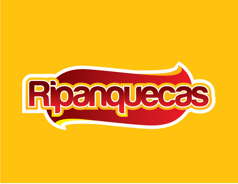
Colors make me think in a Hot-Dog. Unless the "panquecas" are something similar i would try something different. Even this, this colors works great into food market, as frito-lay has stated, don't ya?
Typography: very DaFont, isn't it? the name is, i think, harabara, or something like that. I mean, the problem is not to use it (obviously the font is there to be used), the problem is that its kind is very "fashionable". Let's imagine how many people are thinking in use it for their own logo (in the best case, in worst, they will use it as the support for the message into their flyers).
If you are thinking to deliver a special feeling with your typography, try giving it a little tweak, so people can't say "that font is harabara and you can repeat that logo directly in dafont site".
This case doesn't occur with another fonts like helvetica or arial or myriad or futura… or even with garamond or the ugly times new roman, which styles are very… ¿normal?, then, what i'm trying to say is: if you're looking to do something different you most do something really different, and if you are trying to do something special you can't focus in a font that has lots of downloads.
In the end i found a good exercise of proportions and integration, but you should consider how much you want to create a unique logo.
If the product is served hot, it would be nice to see it steams (yet they are very used, so i don't know)
The symbol has no meaning as I can't find any pancakes or anything related in it. The font is too crowded, completly unreadable. The colors are nice but they refer to some spicy meat or something..
2 Comments
Colors make me think in a Hot-Dog. Unless the "panquecas" are something similar i would try something different. Even this, this colors works great into food market, as frito-lay has stated, don't ya?
Typography: very DaFont, isn't it? the name is, i think, harabara, or something like that. I mean, the problem is not to use it (obviously the font is there to be used), the problem is that its kind is very "fashionable". Let's imagine how many people are thinking in use it for their own logo (in the best case, in worst, they will use it as the support for the message into their flyers).
If you are thinking to deliver a special feeling with your typography, try giving it a little tweak, so people can't say "that font is harabara and you can repeat that logo directly in dafont site".
This case doesn't occur with another fonts like helvetica or arial or myriad or futura… or even with garamond or the ugly times new roman, which styles are very… ¿normal?, then, what i'm trying to say is: if you're looking to do something different you most do something really different, and if you are trying to do something special you can't focus in a font that has lots of downloads.
In the end i found a good exercise of proportions and integration, but you should consider how much you want to create a unique logo.
If the product is served hot, it would be nice to see it steams (yet they are very used, so i don't know)
Keep up the experiment.
The symbol has no meaning as I can't find any pancakes or anything related in it. The font is too crowded, completly unreadable. The colors are nice but they refer to some spicy meat or something..