Rodvi TV -
Kuja-Hin | Sat, 01/24/2015 - 23:41
Brief from client
It's a logo made for a gamer youtube channel.
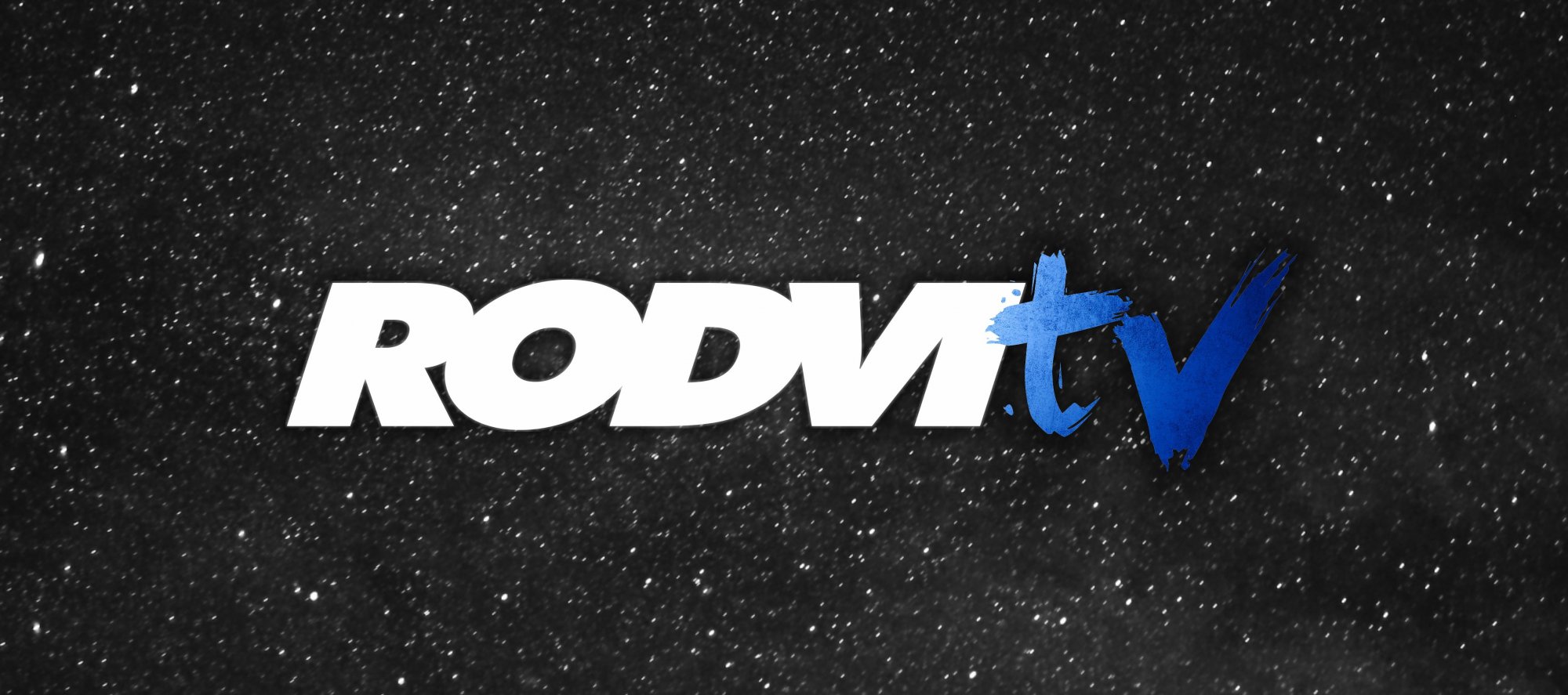
The youtuber asked me to use those color schemes(White, Blue and some kind of dark grey or black) and a night sky if possible.
I am not sure about this logo myself. If you guys could provide me any kind of help about how should I improve it, Ill be really glad(I mean, it's a gamer channel, and Im using a nightsky! It doesnt really makes sense, but it does looks cool). Thank you.
7 Comments
Use a night sky for layouts, not logos. The actual logo is the type here.
The letters are too close together. the V and I almost turn into an M here (without the left stem). The "TV" part doesn't look like it really belongs, either.
Try new things, I think. Experiment more with the letters to interact better.
Actually, the nightsky is not part of the logo itself. But it's part of his youtube banner, so I posted it all together. Only the letters are his "real" logo.
What exactly do you mean by "experiment more with the letters to interact better"? Could you be a little more specific? Thank you very much.
I disagree. I think this works pretty well. Not the best logo ever, but it does the job.
The right side of "TV" is a bit too dark and kinda gets lost in the background.
Funnily enough, I didn't see a starry night in the back but some kind of close up on asphalt. Just make sure your logo works on a bright background too.
Good job.
i also think the V and the I are too close, i thought it was a M, maybe try to seperate the letters a little more? apart of that nothing much to stay it looks sharp
I like this a lot actually. Simple is usually better in logo design. Good job. :)
Out of curiosity, could we see this on just a plain background instead of a texture?
Thank you and sure, something like this?
I like the over all feel feel for the logo, i think the TV can stand out more. To me it is disappearing into the background