Rugged Kitchen
mcphil | Sun, 10/02/2016 - 17:49
Brief from client
To create an identity for a vegetarian plant based food company that recreates popular baked goods and desserts into healthy, vegan options. Brand is youthful, bold and likes to deviate from the norm.
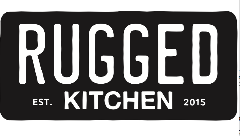
I wanted to create a vintage license plate that was representative of the the word "rugged". The rebellious tone of Bonnie and Clyde, hitchhikers, hippies and the free spirit movement of millennials who are always searching for new ideas and new products.
Looking at other brands with the word rugged, I didn't want to take a literal approach, but refined the edges to be slightly rough and worn.
Please let me know what you think of the font selections. I tried to recall the fonts of common license plates.
1 Comments
Sorry, I'm late on this one.
It doesn't look bad, but it seems you went for just a rugged look and feel and that's it. I don't get any idea of all those things you talk about in your description. To be honest, I can see this as a sign in some road stop joint in Bumfuck, Idaho.
Maybe spend more time sketching out ideas.
Keep it up!