S. Design
Shar Dama Ka | Mon, 01/04/2016 - 22:03
Brief from client
A freelance identity I would like to give my self. Just a simple symbol that is a hybrid between a S and a D, accompanied by a modern type.
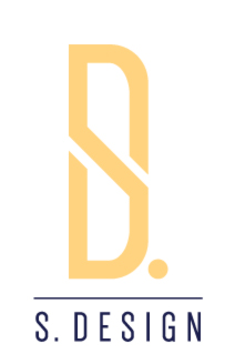
A freelance identity I would like to give my self. Just a simple symbol that is a hybrid between a S and a D, accompanied by a modern type.
24 Comments
Nice, simple and effective. The symbol is dead on.
I'm not sure about the dot. I'm really not feeling that bright orange color. Does SD originally stand for "S Design" or "Shar Dama"? As a designer, i would always stay away from having the word "designer" in my logo =)
Great job.
It is actually a yellow, but that is not a big deal I just pulled a couple colorways from the web that I liked, that just happened to be the one I chose.
I would like to always be changing the color depending on the context it is being used. But no hah, it doesn't actually stand for S Design or Shar Dama; Shar Dama Ka is actually a fictional word/name that stands for First Warrior Cleric or Deliverer in my favorite book series. The S and D actually Stand for my name Spencer DuMond. But I think Shar Dama sounds good I might change it to that. I am just not fond of my name. Just Shar Dama alone would mean First Warrior. So I don't know I might give that a go.
Thanks for advice. Glad you approve.
I posted some colorways; let me know if you have a favorite or if any work.
The period does offset the horizontal alignment just a bit. I'd definitely consider dropping it.
Just needs a compelling color scheme, now. Looks really nice overall.
I posted some colorways; let me know if you have a favorite or if any work.
.
You posted some great choices, however I like this version the best.
Solid choice. This is actually the first colorway I assembled, something about the deep forest green with the hiking boot gold really strikes me as clean and subtly powerful at the same time.
Thanks for the feedback!
.
.
.
This one is also a decent choice.
Yea the Folk Melon was also up there on my choices as well, I was skeptical about that unripe melon pink, but when combined with that deep forest green it really holds its weight in terms of looking ripe. haha
Those color names are just awesome :)
Haha thanks. I had a lot of fun coming up with them.
.
.
.
.
.
.
Would pick this one. Beautiful green! I'll also agree with the others that it looks better without the dot.
i definitely like it without the dot. nicely done
Thank you.