Sachs CNV
dionisdei | Mon, 04/02/2012 - 16:48
Brief from client
A friend from Germany asked me to design a logo for his computer and laptop service company
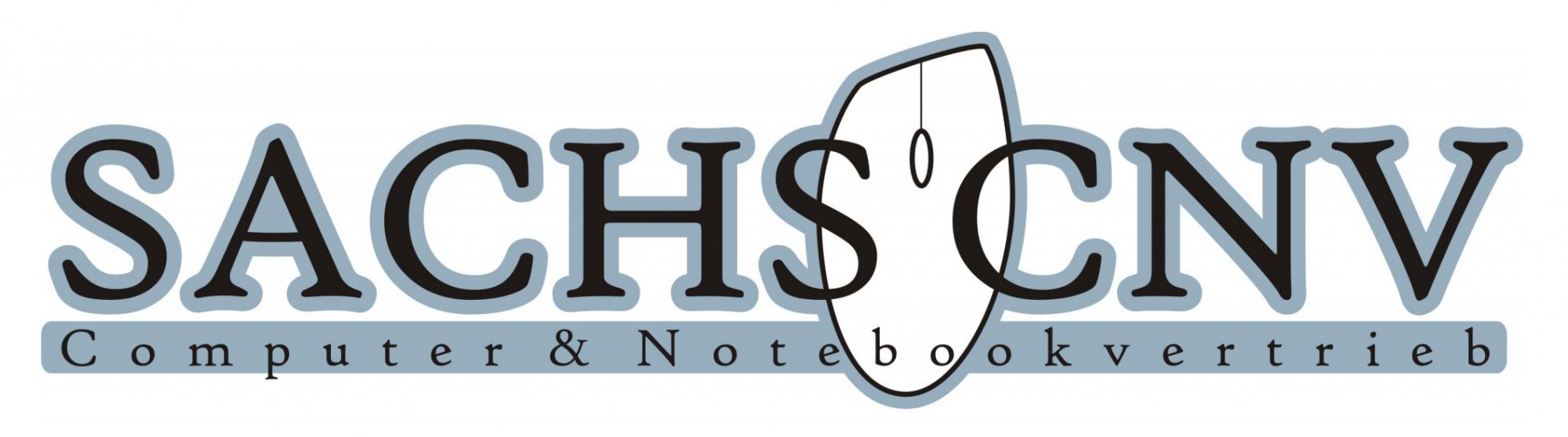
I originally design 3 logos for him to chose from. The first one is minimal, based only on the CNV initials. The second and third one are mostly based on computer elements, a laptop and a mouse.
4 Comments
This is the worst of the 3 so far.
Really? Why? This is my favorite of them all
Colors too close in value (squint and you'll see you can't see the small type at all), the excess kerning will make the second line 3 or 4 pt type at business card size. The mouse is a very over used symbol, if you are going to include one make it innovative or dead simple. The SAC kerning needs attention as well, try not to rely on the computers idea of kerning. Hope this helps, I don't want to deflate your enthusiasm.
No deflation, I'm actually glad, your comment is helpful and brigs out stuff I didn't thought of. I'll prepare a new version, see what can I improve.