salineros
werocuentas | Mon, 02/24/2014 - 00:11
Brief from client
Baseball Team
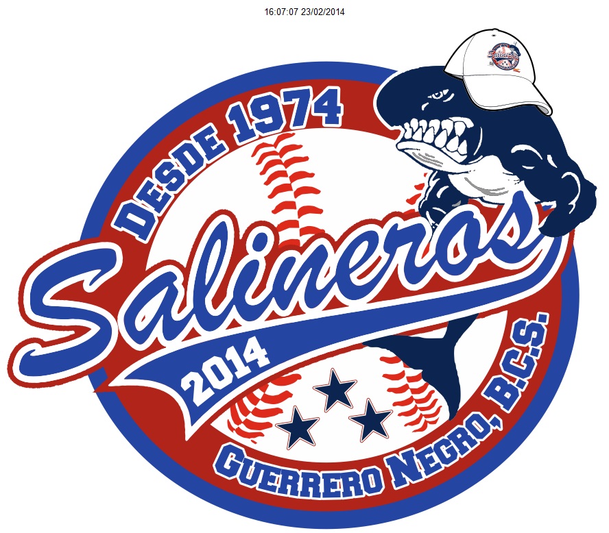
Is the logo represents our Baseball team in our people reaches far the whale and are a people where we export salt to much of the world, hence the name of SALINEROS ..... want to be judged, I do in order to listen to suggestions ........
1 Comments
This is not too bad. I like the vintage thing going on here.
But as it has been previously stated, it's a mess. Too many elements and strokes.
Clean it up. Remove that logo on the mascot cap. Speaking of the mascor, it looks a bit like a clip art? Did you do it yourself or was it just provided to you? There's a slight discrepancy between it and the rest of the design.
The main font works, as it was basically made of this type of application. But it's a bit lost within all those elements. Make it bigger, so it really pop out more. I would remover the "desde 1974" and "Guerrero Negro..." or at least make them less prominent.
I would also remove the laces in the background and the 3 stars, or place them else where. It's just a matter of composition, in the end.
Good luck.