Sardinia Core
NicoP | Tue, 11/15/2016 - 00:11
Brief from client
Sardinia Core is a web resource for selling unique holidays in the center of Sardinia (Italy).
The company offers experiences with local guides who introduce customers to the most authentic activities such as picnic in the mountains with the shepherds, boat trip with the fishermen.

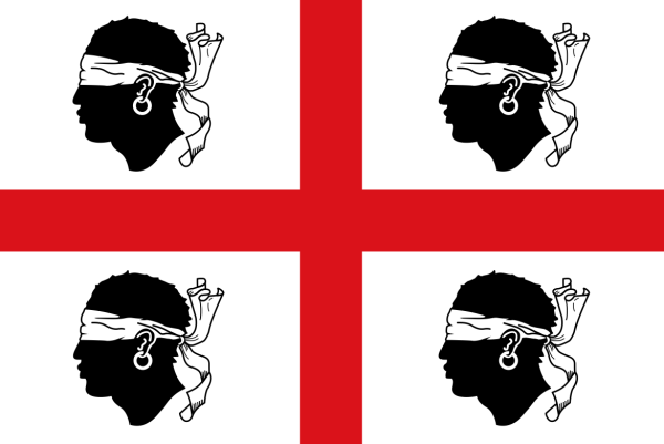
The logo shows elements from the Sardinian flag, available at this link:
http://www.arthurjpenn.com/wp-content/uploads/2015/11/screen-shot-2013-1...
5 Comments
The bands are too high to be covering their eyes like in the flag so they look like headbands.
Making this look like four tennis players are staring at each other while being trapped inside a pair of red Mary Jane shoes. Honestly, I don't get it.
Thanks Waffles, I wanted to explore the idea of drawing the flag elements inside a heart shape, but it obviously does not work!
I still intend to include the 4 guys of the flag in the final design, but I am trying a different approach.
What do you think of this one? It's just a scratch, but is it worth working further on it?
This one looks very...German, if you know what I mean.
Perhaps to simplify you could try including only one flag guy, or maybe stack all four in an interesting way?
:)
You skipped a few fundamental steps in your creative process: research, inspiration (www.pinterest.com get an account right now) and more importantly SKETCHING. I cannot stress enough how this is essential. Spend hours doodling ideas on paper. Don't create directly on the computer. You'll only wind up with poorly thought-through, half-assed logos like these two examples.