Scriptish
Joe White | Fri, 08/02/2013 - 21:49
Brief from client
To express dedication to design with clear goal and intention in mind.
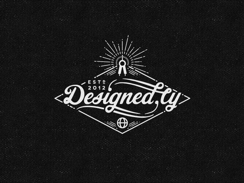
Quite a tricky one since the name has a dot in the middle. This needs to be read as if its one word but still to make the dot apparent.
12 Comments
Scripted
Good times.
You have your own style and i like it.
Ok, don't get angry just yet. I red thumbed the type not because it's terrible, but it looks a bit too much like the Coke font, especially the D. I'm also not so sure how to read the end of the text. Is it .ly or .cy?
The rest is just Joesome, as always.
thumbs down typography?
why shawali? why!!!???
oh the humanity...
Haha, This site is for critique after all. The logo itself is 'designed . ly ' And it needs to be read as if its one word. A combination of Designed and Nicely.
Its the new domain names, so some new moves in typography may be needed if clients are going to ask they include the domain tag. I don't see it the name working, but its impossible to explain away from these ideas. Much better in 2013 to to call in just"Designed Nicely", But thats not 2.0 enough.
If we should read it as one word u have 2 over work it.
I think if u erase the point after the "d" it would be much clearer.
Maybe u also have 2 rework the L that it realy looks like one :D Maybe making the counter a bit wider could help.
At first I thought it said Designed by, but that's not a b, is it?
Perhaps you should extend the bottom decorative line to meet the base of the l, instead of having it go up following the decoration on the d?
Like so?
(oh, the nerve!!!)
This is really cool! I owe you one Venus!
Happy to be of help! :D
sorry but I also have to thumbs down the typography, I like it but I think you can improve it... at first look I couldn't also realize if it was ly or cy...
But anyway is great... BTW I prefer the white letters and black background....
This logo is lovely! But I agree with the comments above about "ly" or "cy" reading".