Brands of the World is the largest free library of downloadable vector logos, and a logo critique community. Search and download vector logos in AI, EPS, PDF, SVG, and CDR formats. If you have a logo that is not yet present in the library, we urge you to upload it. Thank you for your participation.
Version history
Version 1

- I
- S
- T
- C


6 Comments
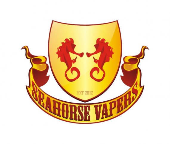
Well I'll just state the obvious by saying the text is warped to much and is now distorted. That's a big red flag. I would try to use more solid colors and stay far away from gradients especially metal ones. The font is not a good choice either, it just screams dafont.com. As far as the seahorses, I would make/dl something more flat instead of 3d. Most crests have flattened graphics.
thanks for the comment sir!
At smaller scales, SEAHORSE VAPERS becomes very hard to read. Try another, less decorated font and don't warp it so much.
very well sir, good point on that
I agree with the text being way too warped. The font is too stretched and is rendered really ugly.
I have to particular beef with the font choice, beside the fact it's the one from Desperado beers.
Also, too many gradients.
You need to simplify.
Good luck.
thank you sir!